3

Making a global projected country polygon map layer for Tableau

I have been struggling to find a solution for a common use case. I want a tool for global thematic webmapping that:

  • Complies with the UN Geospatial Information Section’s policy on displaying national borders and disputed territories
  • Looks good and performs well for highlighting country areas for display on a global scale
  • Shows small island states without having to zoom
  • Can be displayed in a projection appropriate for global thematic maps (e.g. Robinson)
  • Can be used to create dashboards on BI platforms like Tableau

I finally found a good candidate, and I want to share so that others can use it as well. Creating this layer involves an interesting exercise in QGIS, Mapbox, and Tableau. You can read more about that below, or skip it and download this Tableau worksheet to incorporate it into your own dashboards or reproduce by yourself.

Click on the image to view and download the Tableau worksheet

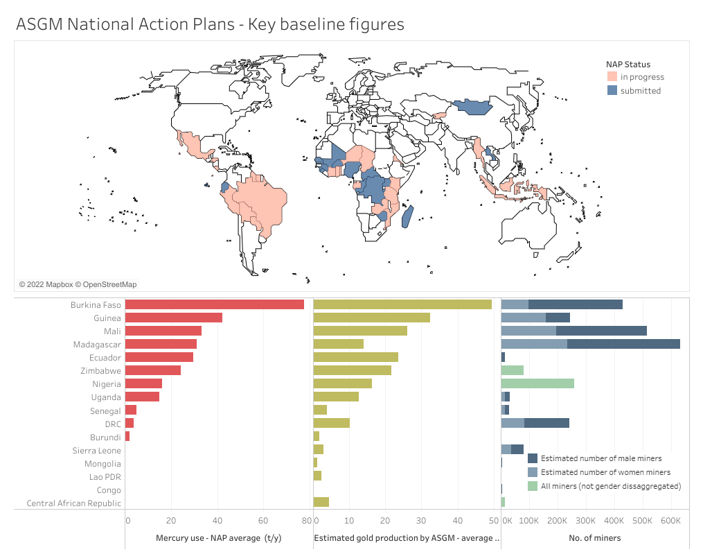
Here is an example of a dashboard that uses the map:

Click on the image to view the interactive dashboard

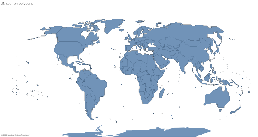
The first stop was finding the right vector map layer. Fortunately, the UN Geospatial Information Section recently published the “cartotile” layer, which uses a stylized design and renders all the country borders and disputed territories in the UN approved manner. It displays small island states as squares which are clearly visible even at maximum zoom. If you’re building your own site and are comfortable using Mapbox-GL-JS then your solution is here.

But I wanted something I could use in Tableau. I got my hands on the geojson files for this layer (including country polygons and borders). Simply importing into Tableau would not work because the map would be displayed in Web Mercator (Tableau automatically converts all geographic layers to Web Mercator.) rather in than the Robinson projection I wanted. The Mercator projection is not a good choice for global thematic maps because the area distortion at the high latitudes is too great. And Tableau is not able to do other map projections.

Enter this clever workaround developed by Sarah Battersby. The ideas is to create your map in the Robinson projection (or whatever one you want) but trick Tableau into thinking it’s projected in Web Mercator. Obviously this will not work if you have other geographic data you want to overlay in Tableau because the country polygons will not be shown in correct geographic space. But for our purposes of highlighting country areas it will work just fine.

You can use QGIS to reproject the layer and then alter the layer properties to trick Tableau by changing the coordinate system to Web Mercator. Enjoy the invigorating feeling you get from committing this spatial transgression!

You can then upload this layer into Tableau and join it with your country data. But there is one more step for the full solution. Recall that our UN map has a layer with borders, including some dashed lines. To add the borders we need to create a base map. To do this, use the same trick in QGIS with the borders layer, and then save it and create and style a tileset in Mapbox using the altered layer. Finally this Mapbox map can be added as a background map in Tableau. It’s all explained by Sarah in another detailed post.

There are other options for making a webmap in projections that are not Web Mercator. Flourish’s Projection Map template works very well, and you don’t have to mess with the above workaround. It changes the projection for you. You can also use Carto, as in this example. A really interesting development is Adaptive Projections from Mapbox. With this tool the map projection changes as the user zooms, so that zoomed-out views appear in a projection applicable for global viewing (e.g. Robinson), but zoomed-in views appear in Mercator to avoid distortion. It’s a pretty cool technical achievement.

Please let me know if you know of any other solutions or ideas for this type of mapping.

4

Chart Makeover – Pie Charts to Slope Chart

There are almost always several ways to graphically present a given dataset. The best one depends on the message you’re trying to convey. Recently, our team was trying to show progress among national governments towards passing laws that ban the use of lead in paint. (Lead is highly toxic, and lead in paint is a particularly pernicious exposure route for children.) After almost two years of work, only a few of the countries we are working with had adopted final laws, but nearly all had started to take action and were on the way to legislating. The initial idea for showing the data was two pie charts.

Comparison of the progress toward lead-paint laws in about eighty countries that work with the Global Alliance to Eliminate Lead Paint

But we felt we could improve on this. They main message – that the number of countries not taking action fell dramatically – was not coming through strongly enough. So we decided to try using a slope chart.

Click on the image for the interaction version of the graphic

With the slope chart, the steep drop in the number of countries not yet taking action (from 61 to 10) really stands out for the user, because of negative slope and color. The number of countries progressing to higher stages increases from 2019 to 2021, as seen by the positive slope of the blue line.

This design also gave me the opportunity to try out datawrapper, which I had never used. First impression: a very intuitive and customizable charting tool! There’a a tutorial specifically for creating slope charts.

This is certainly not the only way to display the data. I think it works, but perhaps there are better solutions. For example two horizontal bars would be a simple and economical solution that would also preserve the part-to-whole relationship. Please feel free to share your ideas!

2

Visualizing commodity trade in mercury with an interactive 3D globe

A data visualization app called Flourish has been getting a bit of buzz recently, so I decided to check it out. I noticed a slick existing template using 3D WebGL for illustrating global trade flows. I have a perfect dataset for that!

Our recently published UN Environment Global Mercury Supply, Trade and Demand Report contains data pulled from the UN Comtrade database on global mercury trade in 2008 and 2015. A few hours of data munging and it was ready to go into the template. Flourish also has a story feature which allows you to walk viewers through an interactive graphic. Sort of like a story map in GIS. Here is the result:

2018-06-27_140608

Click on the image to view the interactive story

A link to the graphic itself (without the story) is here.

One word of caution. No matter how slick a graphic looks and performs, it’s only worth as much as the underlying data. In this case, we know that UN Comtrade data for mercury has some serious flaws, including errors and missed reporting by importing and exporting countries, to say nothing of illegal trade (we discuss these issues in the report). Nevertheless we believe the data is still useful in providing an overview of global trade. But please keep the limitations in mind.

0

Making an Animated GIF Map to Show Progress of the Adoption of the Minamata Convention

If you’ve been anywhere near the internets recently you know that animated gifs are ubiquitous. Never one to miss a trend, I decided to make an animated gif – of a map of course. Actually, gifs can be a good way to show movement in maps and charts. Here are some nice examples and tips.

The animation shows which countries are Parties to the Minamata Convention. They appear in order of ratification.

minamata large loop

The inspiration and method for this animation came from Alasdair Rae:

Alasdair wrote a useful tutorial on how to use QGIS to create amimated map “geogifs”. I’d been looking for an excuse to play around with QGIS (a free desktop GIS application) for a while. In general I found QGIS quite easy to use and feature-rich. My only complaint is not limited to QGIS but applies to all graphical user interface apps. While they are much easier to get started with, they lack the ability to create a reproducible workflow. If I had to make the map again from another dataset I’d have to remember and recreate all the pointing and clicking I did to make the first map. Whereas with something like R one could write a script and use it to reproduce future maps. But perhaps there are some features in QGIS that I am unaware of that could help with reproduciblity.

Data for the map came from my existing Minamata Convention map on CARTO. I exported the shapefile and used it to create the layers in QGIS. My approach differed a bit from Alasdair’s because in my map not all the polygons are highlighed, only the countries that have ratified.

Incidentally, I was not able to create this animation in CARTO because it only allows animation for points, and I needed to show polygons (country borders).

After exporting 84 frames I used gifmaker.me to make the gif rather than the GIMP or Photoshop. Worked just fine.

1

A Mixed Media Data Visualization

When I was a kid I would ask my Mom what she wanted for Christmas, and she would usually say, “Don’t buy me anything. I’d prefer if you just make me something instead.”  I’d always think this was strange. Why would she prefer a silly drawing or collage when she could have something nice, shiny, and new from the store?

Now of course I understand the appeal of a handmade creation. There’s something very personal and unique about it. The same appeal can apply to handmade data visualizations too. Here’s one I made to show who brought the most coffee to the office coffee club:

coffee

Now you might think this is silly – which it is – but it really got people’s attention, and now coffee contributions are way up in 2018. So by that metric it’s an effective visualization!

To see some very attractive and very professional handmade data visualizations, check out Adriano Attus’ work for Moda 24

4

A Dataset of all American and British Bombing Missions in WWII

Sometimes you come across a dataset so interesting you just have to stop everything and visualize it. That’s what happened when I saw a tweet from @JulesGrandin  about the THOR database. THOR stands for Theater History of Operations Reports, and it’s a massive database published by the U.S. Defense Digital Service of all releasable U.S. air operations, including WWI, WWII, and the Korean and Vietnam wars. The data on WWII, which I downloaded, also includes Royal Air Force missions as well as some from the South Africa, Australian, and New Zealand Air Forces.

Here’s an animation (using CARTO) of all 178,263 WWII bombing missions from the database:

And here is a map of all the bombing missions colored by aircraft type. You can clearly see the prevalence of the B17 in the European theater, the B29 in Japan, and the P51 in China. Zoom in and click on the individual points to view other attributes of the bombing missions.

These maps barely scrape the surface of what is possible with this dataset. In addition to aircraft type there are many other attributes, including air force, unit, target type, bomb type, and tonnage of bombs dropped. This page from the Defense Digital Service provides some more interesting tidbits gleaned from the WWII data.

3

Mercury Arcana

Here’s a little project I created to try out the free online graphic design package Canva. While it won’t replace a full-service tool like Illustrator, Canva makes it very easy to create attractive presentations, posters, and simple infographics. It’s definitely worth a try.

1

Deadly Swiss Avalanches, in Maps

In my previous post, I explored a dataset on fatal avalanches in Switzerland from the Swiss Institute for Snow and Avalanche Research (SLF). The dataset also contains the location of each avalanche, and here I’ll explore a few ways to show the data geographically.

In the map above, the location and date of each avalanche is used to make a time lapse with CartoDB’s Torque function. Each flashing white marker is one fatal avalanche. Besides the general location of avalanche risk in Switzerland and the seasonal pulsation of events, this map does not convey all that much information. However, I think it is worthwhile because it drives home the sheer number of deadly avalanches – 361 – during this period. We have to keep in mind that each of these flashing markers is a separate tragedy that together represent the loss of  465 lives.

This map shows the geographical distribution of fatal avalanches by the activity or location involved in the accident. As I discussed in the last post, the great majority occurred in open country during recreational activities like backcountry touring or off-piste skiing. The map illustrates that backcountry touring accidents are distributed fairly evening across the high Alps, while off-piste skiing and snowboarding accidents tend to be clustered. Closer inspection reveals that these clusters occur around high mountain lifts, like this, the largest cluster, one on the north slope of Mt. Gele and Mt. Fort near the resort of Verbier:

Screen Shot 2016-04-01 at 9.43.47 PM

This map also lends itself well to exploration. The Open Street Map base has great detail upon zooming, and you can click on each point to get more information about each avalanche, such as elevation, aspect, date, and number of fatalities.

Finally, here’s a heatmap showing the density of fatal avalanches, with red areas having the highest densities. The cantons of Valais (in the southwest) and Grisons (in the east) have the highest concentrations of deadly avalanche accidents. I used a Landsat mosaic as a base map, which allows for comparison of the relationship between terrain and avalanche density.

All avalanche data from WSL Institute for Snow and Avalanche Research SLF, 25 March 2016. Data and code available here. Maps generated using CartoDB.

2

Deadly Swiss Avalanches, in Charts

Snow-covered mountains are one of the most beautiful sights in nature, but in the wrong circumstances they can kill you. Skiers and other mountain enthusiasts sometimes refer to avalanches as the “white death”, and for good reason. Hundreds die in avalanches every year, and a great deal of effort is spent on trying to understand the factors that cause avalanches in the hope of decreasing this toll.

Located in the Alps and a mecca for winter sports, Switzerland takes avalanches seriously. The Swiss Institute for Snow and Avalanche Research  (SLF) monitors snow conditions, issues warnings, and collects data on avalanches. Their web site is very interesting for those interested in winter sports in the Alps. I find the snow maps particularly useful. But for this post I will use their data on fatal Swiss avalanches in the last 20 years to experiment with different ways to visualize some patterns and relationships.

The dataset includes information on the date, location, elevation, and number of fatalities, in addition to the slope aspect, type of activity involved (e.g. off-piste skiing), and danger level at the time of the avalanche. Over the last 20 years there have been 361 fatal avalanches in Switzerland, for a total of 465 deaths. Most avalanches killed only one victim.

Because I wanted to experiment with radial plots, I’ll focus on the variable of slope aspect in this post. Aspect is the compass direction that a slope faces. In this case we’re looking at the slope where the avalanche occurred. In Switzerland, the majority of avalanches occur slopes facing NW – NE, as you can see from this plot:

rose

The gaps at NNE and NNW are probably artifacts of how the aspect data was reported.

This pattern is common in the temperate latitudes of the northern hemisphere. Avalanches are more common on north-facing slopes because they are more shaded and therefore colder, which allows snowfall to remain unconsolidated for longer. When more snow falls, these unconsolidated layers can act as planes of weakness on which snow above can slide. It’s much more complicated that that, with factors like wind and frost layers coming into play. To learn more about how aspect and avalanches, see here. The pattern is unmistakable, but does it hold all year long? I separated the data by month to find out:

rosefacet

Fatal avalanches occurred in all months, but are much more common December – April

A few interesting insights emerge from this plot. First, February is clearly the most deadly month for avalanches.  In December there are actually quite a few avalanches on SE facing slopes, but by January the predominate direction is centered around NW. In February, and to some extent in March, it changes to N-NE. In April it’s NW again, but by then there are significantly few avalanches. So there are some monthly patterns, but I’m not exactly sure what the explanation is. Of course to really nail this down we’d want to do some statistics as well.

One pattern I expected, but did not see, was a decrease in the dominance of northern aspects later in the spring. I expected this because as the days get longer, the shading effect of north facing slopes decreases. It’s important to remember that these are fatal avalanches, and a dataset of all avalanches would look different. For example there are probably a lot of wet avalanches on southern slopes in the spring. But these are much less dangerous than the slab and dry powder avalanches, and therefore not reflected in the fatality data.

The rose style plots above are useful, but I wanted to try to illustrate more variables at once. So I tried a radial scatter plot:

Fatal Swiss avalanches 1995 - 2016: Slope aspect, elevation, and activity

Click on the image for the interactive Plot.ly version

This plot is similar to the previous ones in that the angular axis represent compass direction (e.g. 90 degrees means an east-facing slope). The radial axis (the distance form the center) represent the elevation where the avalanche occurred. And color represents the type of activity that resulted in the fatality or fatalities. Each point is one avalanche. The data are jittered (random variations in aspect) to minimize overplotting. This is necessary because the aspect data are recorded by compass direction (e.g. NE or ESE). The density of the points clearly illustrates the dominance of north-facing aspects. It’s also clear that most avalanches occur between 2000 and 3000 meters (in fact the mean is 2507 m). In terms of activity, backcountry touring and off-piste skiing and boarding dominate. And avalanches at very high altitudes are mostly associated with backcountry touring, which makes sense, as not many lifts go up above 3000m. Perhaps especially perceptive viewer can make out some other patterns in the relationships between variables, but I can’t. Any thoughts on the usefulness of this plot for the dataset?

Finally, I want to share a couple graphics from SLF (available here). Here is a timeline of avalanche fatalities in Switzerland since 1936:

The average number of deaths per year is 25, but this has decreased a bit in the 20 years. There were also more deaths in buildings and transportation routes prior to about 1985. Presumably improvements in avalanche control and warnings reduced fatalities in those areas. And what happened in the 1950/51 season. That was the infamous Winter of Terror. The next plot shows the distribution of fatalities by the warning level in place when the avalanche occurred:

Interestingly, the great majority of deaths happened when warning levels where moderate or considerable. There were significantly fewer deaths during high or very high warning periods. One reason must be that high/very high warnings don’t occur that frequently, but it’s also likely that skiers and mountaineers exercise greater caution or even stay off the mountain during these exceptionally dangerous times. There’s probably some risk compensation going on here. To really quantify risk, you have to know more than just the number of deaths at a given time or place. You also have to know how many people engaged in activities in avalanche country without dying. One clever approach is to use social media to estimate activity levels, as demonstrated in this paper.

Have fun in the mountains and stay safe!

Data and code from this post available here.

All data from WSL Institute for Snow and Avalanche Research SLF, 25 March 2016

5

Has Your Country Ratified the Minamata Convention on Mercury?

This map shows the current status of ratifications of the Minamata Convention on Mercury. Although I update it frequently, check mercuryconvention.org for the most recent status. The map also shows countries engaged in Minamata initial assessment (MIA) and artisanal and small-scale  gold mining national action plan (NAP) projects funded by the Global Environment Facility (GEF), along with the implementing agencies. Use the “Visible layers” function on the map to toggle between ratification status, MIAs, and NAPs. The full screen button, located below the zoom controls, is also useful.

Data on ratification and GEF project status from the Interim Secretariat of the Minamata Convention and UNEP. Country boundaries from Natural Earth. Mapping done in CartoDB using Robinson projection.