A few years ago I had an idea for a smartphone app for homeowners considering installing rooftop solar panels. The homeowner would climb on top of the house and place the smartphone the roof. The app would use the phone’s gyroscope and compass to calculate the orientation of the roof’s plane in space, much like a geologist uses a Brunton compass to measure strike and dip of rock strata. Knowing the orientation and location of the roof, the app could make an estimate of solar insolation and help the homeowner work out the economics of the decision.
If this is such a good idea, why am I telling you all about it? Because I fear that it will soon be obsolete, and high resolution remote sensing data will be used to investigate initial feasibility of rooftop solar.
That is exactly what a website called Mapdwell Solar System is doing, at least in Washington DC. This company uses LiDAR to produce a very high resolution digital elevation model of the urban landscape. They use an algorithm to find all the rooftops, and for each one square meter area, they calculate the solar potential. The LiDAR data is so detailed that they can calculate the slope and orientation of roofs, as well as shading that occurs from buildings and trees. These one square meter pixels (color coded so that bright yellow equals higher solar potential) are overlaid on a satellite image of the city. Here’s what it looks like:
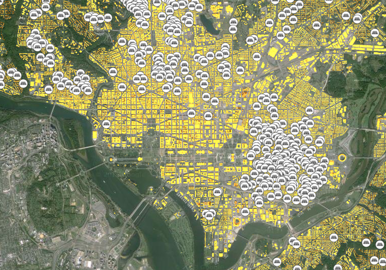
The white circles are existing solar rooftop units. To illustrate how this works, I decided to use Mapdwell to figure out what EPA could do with rooftop solar. I zoomed in and selected the headquarters complex (WJC Building and EPA East and West) in Federal Triangle. Here’s what it looks like:

The yellow areas are where Mapdwell recommends putting solar photovoltaic panels. Bright yellow, the optimal solar locations, are concentrated on the south facing parts of the roof. The most interesting part is the report generated that estimates cost of the system, federal tax credits, power output, payback time, and more. Here’s a summary from the EPA example:
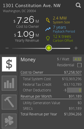
You can see that the system would cost about $10 million, but federal tax credits would reduce that by about $3 million. (Can federal buildings claim this tax credit?). It would have a capacity of 2.4 MW, and generate revenue from solar renewable energy certificates (SRECs) as well as offset electricity purchases from the grid. And the payback time would be 7 years with an internal rate of return of about 14%. That sounds like a good investment. It would also offset enough greenhouse gas emissions to be equivalent to planting 12,000 trees.
This is a very powerful tool. Unfortunately it’s only available in Washington, DC, and Cambridge and Wellfleet, MA, but hopefully your neighborhood will be covered before too long.

