Graphics for Fitness Motivation using Plot.ly

This post is intended to illustrate the cool things you can do with plot.ly’s API for R. Plot.ly is a web-based tool for making interactive graphs. It uses the D3.js visualization library, and lets you create very attractive plots that can be easily shared or embedded in a web page. With the R API you can manipulate data in R and then send it over to plot.ly to create an interactive graph. There’s also a function that let’s you create a plot in R using ggplot2, and then shoot the result directly over to plot.ly (summarized nicely here).

I have great little free app on my iPhone called Pedometer++ that keeps track of how many steps I take each day. I exported the data, plotted up a time series with ggplot2, and used the API to make the graph in plot.ly. It worked quite nicely. The only hiccup was that plot.ly did not recognize the local regression curve, so I had to add that separately.

You can see from the plot that I’m not consistently meeting my 10,000 step goal. In fact, I averaged 7,002 steps over this period. That still comes out to a total of 1,470,463 steps. From October through February my step count was trending slightly downward, but since then it’s picked up. Maybe that had something to do with the cold winter. Hopefully as the weather (and my motivation) improves, I’ll hit my goal.

steps_taken_per_day_october_2014_-_november_2014

Click to see the interactive version

Any here’s a bonus box plot showing steps taken by day of the week (also using the R API):

steps_per_day2c_october_2013_-_may_2014

Click to see the interactive version

If there are any pedometer users out there who are interested, let me know and I can post the code.

Advertisement

Updated Global Mercury Pollution Viz and Graphics

One of the first posts on this blog was about using Tableau to visualize data on global emissions of mercury.  I’ve gotten suggestions from a few people and given the graphic a bit of a face lift. Click on the image to see the interactive viz:

Dashboard_1 (3)

Click for interactive graphic

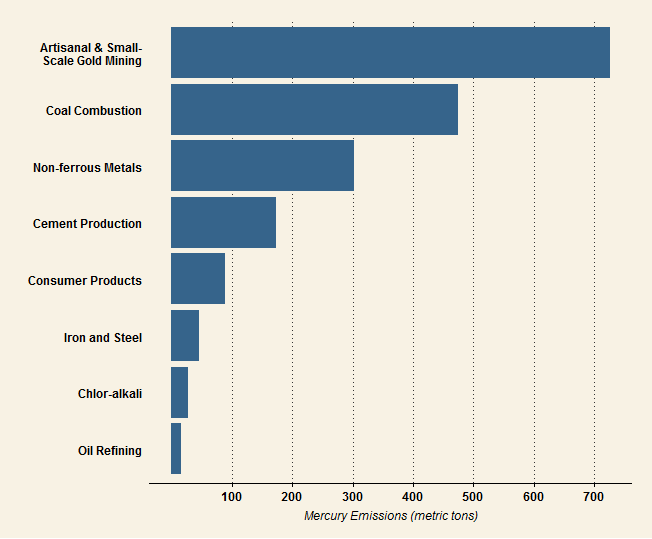
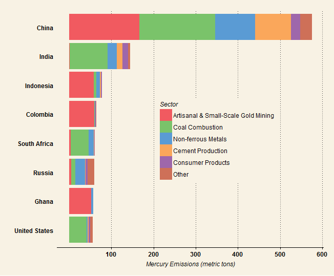
I also used the same dataset to make some static graphics using ggplot2 and the ggthemes package. I’d love any input on how to improve the the look and feel of both these and the Tableau viz. I’ve always found picking good colors very challenging, so thoughts on the palettes are especially welcome.

hg.emissions.bysec

The 8 industry sectors with the highest global mercury emissions. Data for 2010 from the 2013 UNEP Global Mercury Assessment.

hg.emissions.bycty_fewm

Countries with the highest mercury emissions. Data for 2010 from the 2013 UNEP Global Mercury Assessment.

Visualizations about Data Visualization

It’s no secret that interest in data visualization has been growing in recent years. Don’t believe me? Let me show you a graph:

google trends

From Google Trends

Sure, humans have been presenting information graphically for hundreds, if not thousands, of years, with increasing sophistication.  We still study the work of people like John Snow, William Playfair and Florence Nightingale for their innovations in graphical presentation. Today, however, with the increasing availability of large, rich, and easily accessible datasets, and the proliferation of software tools for creating graphics, we are seeing an explosion in the amount of data visualizations. This is a great development. I obviously think so, since I jumped on the bandwagon.

The recent ubiquity of the data visualization brings with it a new subgenre, the meta-visualization. Visualizations about visualizations. Some of these describe what data visualization is, or should be. Some present information about common types or characteristics of visualizations. Still others poke fun at cliches, poor practices, and the very pervasiveness of visualization as a medium for communicating information. Let’s take a look at some examples.

First, here’s the Infographic of Infographics:

Then there’s this periodic table of types of visualizations:

periodic viz


Robert Kosara is not amused. For an nice take on the actual periodic table (the one with the elements), have a look at this.

Continuing with the periodic table theme, here is a periodic table of period tables. This is very meta.

The Periodic Table of Periodic Tables

But does this periodic table of periodic tables contain itself? (It does.) And, more importantly, should a periodic table of all periodic tables that do not contain themselves contain itself.

Some graphics attempt to illustrate what characteristics a good data visualization should have. Like this 4-set Venn diagram, for example:

Or like this Venn-like diagram, which I’m not quite sure how to read:

Now if you really want to turn it up to 11, or more accurately, up to seven, you could employ this epic 7-set Venn diagram:

7venn

Click on this. You won’t regret it.

Another category of meta-visualizations contains humorous or satirical ones. These are not literally visualizations of other visualizations, but they are about visualization as a medium. These are funny, self-aware takes on the cliches and excesses in the field. Pie charts that skewer the graphical form of the pie chart itself are practically a sub-subgenre in themselves:

pie-i-have-eaten-chart

Really, nobody seems to have any love for the pie chart.

Or, you know how there are like a million maps on the internet showing which state or country is the most this, or the most like that? Well that’s the set up for this brilliant satirical tweet:

And on the topic of maps, here’s a gem from xkcd:

Its fully because it’s true!

Finally, we venture into silliness with one of my all-time favorites, All You Need to Know about Lady Gaga’s Hit “Bad Romance” in One Chart:

To sum up, here is a word cloud visualization of this post:

viz word cloud