Deadly Swiss Avalanches, in Charts

Snow-covered mountains are one of the most beautiful sights in nature, but in the wrong circumstances they can kill you. Skiers and other mountain enthusiasts sometimes refer to avalanches as the “white death”, and for good reason. Hundreds die in avalanches every year, and a great deal of effort is spent on trying to understand the factors that cause avalanches in the hope of decreasing this toll.

Located in the Alps and a mecca for winter sports, Switzerland takes avalanches seriously. The Swiss Institute for Snow and Avalanche Research  (SLF) monitors snow conditions, issues warnings, and collects data on avalanches. Their web site is very interesting for those interested in winter sports in the Alps. I find the snow maps particularly useful. But for this post I will use their data on fatal Swiss avalanches in the last 20 years to experiment with different ways to visualize some patterns and relationships.

The dataset includes information on the date, location, elevation, and number of fatalities, in addition to the slope aspect, type of activity involved (e.g. off-piste skiing), and danger level at the time of the avalanche. Over the last 20 years there have been 361 fatal avalanches in Switzerland, for a total of 465 deaths. Most avalanches killed only one victim.

Because I wanted to experiment with radial plots, I’ll focus on the variable of slope aspect in this post. Aspect is the compass direction that a slope faces. In this case we’re looking at the slope where the avalanche occurred. In Switzerland, the majority of avalanches occur slopes facing NW – NE, as you can see from this plot:

rose

The gaps at NNE and NNW are probably artifacts of how the aspect data was reported.

This pattern is common in the temperate latitudes of the northern hemisphere. Avalanches are more common on north-facing slopes because they are more shaded and therefore colder, which allows snowfall to remain unconsolidated for longer. When more snow falls, these unconsolidated layers can act as planes of weakness on which snow above can slide. It’s much more complicated that that, with factors like wind and frost layers coming into play. To learn more about how aspect and avalanches, see here. The pattern is unmistakable, but does it hold all year long? I separated the data by month to find out:

rosefacet

Fatal avalanches occurred in all months, but are much more common December – April

A few interesting insights emerge from this plot. First, February is clearly the most deadly month for avalanches.  In December there are actually quite a few avalanches on SE facing slopes, but by January the predominate direction is centered around NW. In February, and to some extent in March, it changes to N-NE. In April it’s NW again, but by then there are significantly few avalanches. So there are some monthly patterns, but I’m not exactly sure what the explanation is. Of course to really nail this down we’d want to do some statistics as well.

One pattern I expected, but did not see, was a decrease in the dominance of northern aspects later in the spring. I expected this because as the days get longer, the shading effect of north facing slopes decreases. It’s important to remember that these are fatal avalanches, and a dataset of all avalanches would look different. For example there are probably a lot of wet avalanches on southern slopes in the spring. But these are much less dangerous than the slab and dry powder avalanches, and therefore not reflected in the fatality data.

The rose style plots above are useful, but I wanted to try to illustrate more variables at once. So I tried a radial scatter plot:

Fatal Swiss avalanches 1995 - 2016: Slope aspect, elevation, and activity

Click on the image for the interactive Plot.ly version

This plot is similar to the previous ones in that the angular axis represent compass direction (e.g. 90 degrees means an east-facing slope). The radial axis (the distance form the center) represent the elevation where the avalanche occurred. And color represents the type of activity that resulted in the fatality or fatalities. Each point is one avalanche. The data are jittered (random variations in aspect) to minimize overplotting. This is necessary because the aspect data are recorded by compass direction (e.g. NE or ESE). The density of the points clearly illustrates the dominance of north-facing aspects. It’s also clear that most avalanches occur between 2000 and 3000 meters (in fact the mean is 2507 m). In terms of activity, backcountry touring and off-piste skiing and boarding dominate. And avalanches at very high altitudes are mostly associated with backcountry touring, which makes sense, as not many lifts go up above 3000m. Perhaps especially perceptive viewer can make out some other patterns in the relationships between variables, but I can’t. Any thoughts on the usefulness of this plot for the dataset?

Finally, I want to share a couple graphics from SLF (available here). Here is a timeline of avalanche fatalities in Switzerland since 1936:

The average number of deaths per year is 25, but this has decreased a bit in the 20 years. There were also more deaths in buildings and transportation routes prior to about 1985. Presumably improvements in avalanche control and warnings reduced fatalities in those areas. And what happened in the 1950/51 season. That was the infamous Winter of Terror. The next plot shows the distribution of fatalities by the warning level in place when the avalanche occurred:

Interestingly, the great majority of deaths happened when warning levels where moderate or considerable. There were significantly fewer deaths during high or very high warning periods. One reason must be that high/very high warnings don’t occur that frequently, but it’s also likely that skiers and mountaineers exercise greater caution or even stay off the mountain during these exceptionally dangerous times. There’s probably some risk compensation going on here. To really quantify risk, you have to know more than just the number of deaths at a given time or place. You also have to know how many people engaged in activities in avalanche country without dying. One clever approach is to use social media to estimate activity levels, as demonstrated in this paper.

Have fun in the mountains and stay safe!

Data and code from this post available here.

All data from WSL Institute for Snow and Avalanche Research SLF, 25 March 2016

Illustrating the Arc of European Colonialism Using a Dot Plot

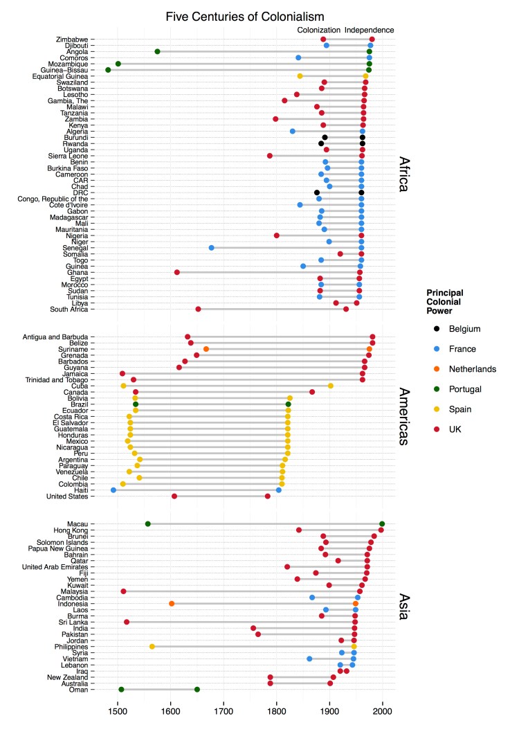
A while back I was thinking about European colonialism and the enormous impact it’s had on world history. Wouldn’t it be nice to have a simple visualization to illustrate colonization and decolonization around the world? It occurred to me that a dumbbell dot plot would work well for this task. Here’s what I came up with:

colonial2

The chart shows the dates of colonization and independence of 100 current nations. The countries are organized into broad regions (Asia, Africa, and the Americas), and sorted by date of independence. Color represents the principal colonial power, generally the occupier for the greatest amount of time.

There are many interesting patterns visible in the chart. For example, you can clearly see Spain’s rapid conquest of Central and South America, and then even more rapid loss of its colonies in the 1820s. The scramble for Africa in the late 19th century stands out well, as does the rapid decolonization phase of the late 1950s through early 1970s.

About the Data

To reduce complexity to a manageable level, I set some limitations on what countries to include. First, the chart shows only those countries victim to Western European colonialism. I don’t include Ottoman, Japanese, Russian, American, or other colonial empires. I also don’t include territories that are still governed by former colonial powers (e.g. Gibraltar). This gets controversial and complicated. Countries that were uninhabited upon discovery by colonial powers are also not included. The same with countries that later gained independence from a post-colonial state (e.g. South Sudan).

The dates of independence come from the CIA World Factbook (here). Dates of colonization were derived by my own research, mostly from Wikipedia country pages. I quickly found that establishing a date of colonization is a somewhat subjective decision. Do you choose the date of first European contact? Formal incorporation of the territory into the colonial empire? For the most part, I chose the date of the first permanent European settlement. Notes on the rationale for the date chosen are include in the data spreadsheet (below). In looking at the chart, it’s important to remember that in many cases colonial subjugation was a long process, moving from initial contact, to trade, conquest, settlement, and incorporation.

Constructing the Plot

I wanted to make this plot using ggplot2 in R, but was not sure about best approach. So I reached out on Twitter to dataviz guru and dot plot enthusiast @evergreendata

The response from the #rstats and dataviz community was extremely constructive and useful. Users  @hrbrmstr@jalapic@ramnath_vaidya, and @plotlygraphs all provided great examples (here, here, here, and here, respectively). In the end, I chose to adapt the approach taken by @jalapic.

A quick note on color: I choose colors from the flags of the principal colonial powers to represent them on the plot (except for the Netherlands for which I picked orange). The idea is to make it easier for the viewer to match the color with the country without having to always go back to the legend. I’d be interested in any reactions to this approach. In general, I’d be thrilled with any feedback on how to make this plot better.

Data and code for the plot:


Country Colonized Independence Region Principal Colonial Power Remarks on independence Remarks on date of colonization
Algeria 1830 1962 Africa France 5 July 1962 (from France) Conquest of Algiers
Angola 1575 1975 Africa Portugal 11 November 1975 (from Portugal)
Antigua and Barbuda 1632 1981 Americas UK 1 November 1981 (from the UK)
Argentina 1542 1816 Americas Spain 9 July 1816 (from Spain) Viceroyalty of Peru
Australia 1788 1901 Asia UK 1 January 1901 (from the federation of UK colonies) Australia Day
Bahrain 1892 1971 Asia UK 15 August 1971 (from the UK)
Barbados 1627 1966 Americas UK 30 November 1966 (from the UK)
Belize 1638 1981 Americas UK 21 September 1981 (from the UK)
Benin 1892 1960 Africa France 1 August 1960 (from France)
Bolivia 1533 1825 Americas Spain 6 August 1825 (from Spain) Conquest of Inca Empire
Botswana 1885 1966 Africa UK 30 September 1966 (from the UK)
Brazil 1534 1822 Americas Portugal 7 September 1822 (from Portugal) Captaincies of Brazil
Brunei 1888 1984 Asia UK 1 January 1984 (from the UK) Treaty of Protection
Burkina Faso 1896 1960 Africa France 5 August 1960 (from France) Become French Protectorate
Burma 1885 1948 Asia UK 4 January 1948 (from the UK) Annexed after Third Anglo-British War
Burundi 1891 1962 Africa Belgium 1 July 1962 (from UN trusteeship under Belgian administration) Originally part of German East Africa
Cambodia 1867 1953 Asia France 9 November 1953 (from France) Originally claimed by Germany
Cameroon 1884 1960 Africa France 1 January 1960 (from French-administered UN trusteeship)
Canada 1534 1867 Americas UK 1 July 1867 (union of British North American colonies); 11 December 1931 (recognized by UK per Statute of Westminster) New France
CAR 1894 1960 Africa France 13 August 1960 (from France) Ubangi-Shari
Chad 1900 1960 Africa France 11 August 1960 (from France) Territoire Militaire des Pays et Protectorats du Tchad�
Chile 1541 1810 Americas Spain 18 September 1810 (from Spain) Santiago founded
Colombia 1510 1810 Americas Spain 20 July 1810 (from Spain) Founding of Santa Mar�a la Antigua del Dari_n
Comoros 1841 1975 Africa France 6 July 1975 (from France)
DRC 1876 1960 Africa Belgium 30 June 1960 (from Belgium) Stanley's first exploration of the Congo
Congo, Republic of the 1880 1960 Africa France 15 August 1960 (from France) Treaty with de Brazza
Costa Rica 1522 1821 Americas Spain 15 September 1821 (from Spain) Arrival of Gil Gonzolez Davila
Cote d'Ivoire 1844 1960 Africa France 7 August 1960 (from France) Establishment of French Protectorate
Cuba 1511 1902 Americas Spain 20 May 1902 (from Spain 10 December 1898; administered by the US from 1898 to 1902); not acknowledged by the Cuban Government as a day of independence First Spanish Settlement
Djibouti 1894 1977 Africa France 27 June 1977 (from France) French Somalialand
Ecuador 1534 1822 Americas Spain 24 May 1822 (from Spain) Conquest of Sebasti�n de Benalc�zar
Egypt 1882 1956 Africa UK 28 February 1922 (from UK protectorate status; the revolution that began on 23 July 1952 led to a republic being declared on 18 June 1953 and all British troops withdrawn on 18 June 1956); note – it was ca. 3200 B.C. that the Two Lands of Upper (southern) and Lower (northern) Egypt were first united politically British occupation
El Salvador 1524 1821 Americas Spain 15 September 1821 (from Spain) Conquest by Pedro de Alvarado
Equatorial Guinea 1844 1968 Africa Spain 12 October 1968 (from Spain) Territorios Espa_oles del Golfo de Guinea
Fiji 1874 1970 Asia UK 10 October 1970 (from the UK) British subjugation
Gabon 1885 1960 Africa France 17 August 1960 (from France) Occupied by France
Gambia, The 1815 1965 Africa UK 18 February 1965 (from the UK) British presence established
Ghana 1612 1957 Africa UK 6 March 1957 (from the UK) Gold coast forts
Grenada 1649 1974 Americas UK 7 February 1974 (from the UK) French found permanent settlement
Guatemala 1524 1821 Americas Spain 15 September 1821 (from Spain) Conquest by Pedro de Alvarado
Guinea-Bissau 1482 1974 Africa Portugal 24 September 1973 (declared); 10 September 1974 (from Portugal) Portuguese gold coast colony
Guinea 1850 1958 Africa France 2 October 1958 (from France) French military penetration in the mid-19th century
Guyana 1616 1966 Americas UK 26 May 1966 (from the UK) Essequebo colony (Durch)
Haiti 1492 1804 Americas France 1 January 1804 (from France) Columbus found La Navidad
Honduras 1524 1821 Americas Spain 15 September 1821 (from Spain) Conquest of Gil Gonz�lez de �vila
Hong Kong 1842 1997 Asia UK none (special administrative region of China) Treaty of Nanking
India 1756 1947 Asia UK 15 August 1947 (from the UK) Company rule by East India Company begins
Indonesia 1602 1949 Asia Netherlands 17 August 1945 (declared) Dutch East India Company Established in 1602
Iraq 1920 1932 Asia UK 3 October 1932 (from League of Nations mandate under British administration); note – on 28 June 2004 the Coalition Provisional Authority transferred sovereignty to the Iraqi Interim Government League of Nations mandate under British administration
Jamaica 1509 1962 Americas UK 6 August 1962 (from the UK) First Spanish settlement
Jordan 1922 1946 Asia UK 25 May 1946 (from League of Nations mandate under British administration) League of Nations mandate under British administration
Kenya 1888 1963 Africa UK 12 December 1963 (from the UK) Imperial British East Africa Company
Kuwait 1899 1961 Asia UK 19 June 1961 (from the UK) British protectorate
Laos 1893 1949 Asia France 19 July 1949 (from France) French protectorate of Laos
Lebanon 1920 1943 Asia France 22 November 1943 (from League of Nations mandate under French administration) League of Nations mandate under French administration
Lesotho 1838 1966 Africa UK 4 October 1966 (from the UK) arrival of Trekboers
Libya 1912 1951 Africa UK 24 December 1951 (from UN trusteeship) Italian North Africa
Macau 1557 1999 Asia Portugal none (special administrative region of China) Portugal settlement
Madagascar 1882 1960 Africa France 26 June 1960 (from France) Malagasy Protectorate
Malawi 1876 1964 Africa UK 6 July 1964 (from the UK) Trading settlement at Blantyre
Malaysia 1511 1957 Asia UK 31 August 1957 (from the UK) Portuguese Malacca
Mali 1880 1960 Africa France 22 September 1960 (from France) French Sudan
Mauritania 1890 1960 Africa France 28 November 1960 (from France) Approximate
Mexico 1519 1821 Americas Spain 16 September 1810 (declared); 27 September 1821 (recognized by Spain) Spanish conquest
Morocco 1884 1956 Africa France 2 March 1956 (from France) First Spanish protectorate
Mozambique 1501 1975 Africa Portugal 25 June 1975 (from Portugal) Captaincy of Sofala
New Zealand 1788 1907 Asia UK 26 September 1907 (from the UK) Colony of New South Wales
Nicaragua 1524 1821 Americas Spain 15 September 1821 (from Spain) First Spanish settlements
Nigeria 1800 1960 Africa UK 1 October 1960 (from the UK)
Niger 1899 1960 Africa France 3 August 1960 (from France) Vouley Chanoine Mission
Oman 1507 1650 Asia Portugal 1650 (expulsion of the Portuguese) Occupation of Muscat
Pakistan 1765 1947 Asia UK 14 August 1947 (from British India) Start of company rule in Indian subcontinent
Papua New Guinea 1884 1975 Asia UK 16 September 1975 (from the Australian-administered UN trusteeship) German New Guinea
Paraguay 1537 1811 Americas Spain 14 May 1811 (from Spain) Founding of Asuncion
Peru 1532 1821 Americas Spain 28 July 1821 (from Spain) Battle of Cajamarca
Philippines 1565 1946 Asia Spain 4 July 1946 (from the US) Miguel Lopez de Legazpi arrives
Qatar 1916 1971 Asia UK 3 September 1971 (from the UK) British protectorate
Rwanda 1884 1962 Africa Belgium 1 July 1962 (from Belgium-administered UN trusteeship) Assigned to German East Africa
Senegal 1677 1960 Africa France 4 April 1960 (from France); note – complete independence achieved upon dissolution of federation with Mali on 20 August 1960 French control
Sierra Leone 1787 1961 Africa UK 27 April 1961 (from the UK) "Province of Freedom"
Solomon Islands 1893 1978 Asia UK 7 July 1978 (from the UK) British protectorate
Somalia 1920 1960 Africa UK 1 July 1960 (from a merger of British Somaliland that became independent from the UK on 26 June 1960 and Italian Somaliland that became independent from the Italian-administered UN trusteeship on 1 July 1960 to form the Somali Republic) Dervish state falls
South Africa 1652 1931 Africa UK 31 May 1910 (Union of South Africa formed from four British colonies: Cape Colony, Natal, Transvaal, and Orange Free State); 31 May 1961 (republic declared); 27 April 1994 (majority rule) Cape Town founded
Sri Lanka 1517 1948 Asia UK 4 February 1948 (from the UK) Portuguese establish Colombo
Sudan 1882 1956 Africa UK 1 January 1956 (from Egypt and the UK) British Occupation
Suriname 1667 1975 Americas Netherlands 25 November 1975 (from the Netherlands) Capture by Dutch
Swaziland 1890 1968 Africa UK 6 September 1968 (from the UK) British, Dutch, Swazi trimviral administration
Syria 1923 1946 Asia France 17 April 1946 (from League of Nations mandate under French administration) League of Nations mandate under French administration
Tanzania 1885 1964 Africa UK 26 April 1964; Tanganyika became independent on 9 December 1961 (from UK-administered UN trusteeship); Zanzibar became independent on 10 December 1963 (from UK); Tanganyika united with Zanzibar on 26 April 1964 to form the United Republic of Tanganyika and Zanzibar; renamed United Republic of Tanzania on 29 October 1964 German East Africa (Zanibar controled by Portuguese in 16th century
Togo 1884 1960 Africa France 27 April 1960 (from French-administered UN trusteeship) German Protectorate
Trinidad and Tobago 1530 1962 Americas UK 31 August 1962 (from the UK) Spanish settlement
Tunisia 1881 1956 Africa France 20 March 1956 (from France) French Invasion
Uganda 1894 1962 Africa UK 9 October 1962 (from the UK) Uganda Protectorate
United Arab Emirates 1820 1971 Asia UK 2 December 1971 (from the UK) Trucial States
United States 1607 1783 Americas UK 4 July 1776 (declared); 3 September 1783 (recognized by Great Britain) Jamestown
Venezuela 1522 1811 Americas Spain 5 July 1811 (from Spain) Settlement of Cumana
Vietnam 1862 1945 Asia France 2 September 1945 (from France) Cochinchina
Yemen 1839 1967 Asia UK 22 May 1990 (Republic of Yemen was established with the merger of the Yemen Arab Republic [Yemen (Sanaa) or North Yemen] and the Marxist-dominated People's Democratic Republic of Yemen [Yemen (Aden) or South Yemen]); note – previously North Yemen became independent in November 1918 (from the Ottoman Empire) and became a republic with the overthrow of the theocratic Imamate in 1962; South Yemen became independent on 30 November 1967 (from the UK) British occupy Aden
Zambia 1798 1964 Africa UK 24 October 1964 (from the UK) Claimed by Portugal
Zimbabwe 1888 1980 Africa UK 18 April 1980 (from the UK) British South Africa Company

view raw

colonial.csv

hosted with ❤ by GitHub


# Dumbell Dot Chart of European Colonialism
library(ggplot2)
library(tidyr)
library(dplyr)
library(scales)
colonial <- read.csv("colonial.csv", stringsAsFactors=FALSE,
col.names = c("country", "colony", "independence", "region", "pcp",
"remarks_ind", "remarks_col"))
df1 <- colonial %>% gather(status,year,2:3)
ind <- df1 %>% filter(status=="independence") %>% arrange(desc(year)) %>% .$country
df1$country <- factor(df1$country, levels=rev(ind))
colonial$country <- factor(colonial$country, levels=rev(ind))
#data frames used for labeling only one of the plot facets
f_labels1 <- data.frame(region = c("Africa", "Americas", "Asia"), label = c("Colonization", "", ""))
f_labels2 <- data.frame(region = c("Africa", "Americas", "Asia"), label = c("Independence", "", ""))
plot <- ggplot() +
geom_segment(data=colonial, aes(x=colony, xend=independence, y=country, yend=country), color="gray77",lwd=1)+
geom_point(data=df1, aes(year, country, group=pcp,color=pcp), size=3) +
scale_color_manual(values=c("#000000", "#318CE7", "#FF6600", "#006600", "#F1BF00", "#CF142B"))+
ggtitle("Five Centuries of Colonialism") +
xlab("") + ylab("") +
facet_grid(region ~ ., scales = "free_y", space = "free_y" ) +
labs(color = "Principal\nColonial\nPower") +
scale_y_discrete(expand = c(0,2))+
geom_text(x = 1880, y = Inf, aes(label = label), data = f_labels1, vjust = 1, size = 3)+
geom_text(x = 1975, y = Inf, aes(label = label), data = f_labels2, vjust = 1, size = 3)+
theme_bw() +
theme(
panel.border = element_blank(),
plot.title = element_text(vjust=1),
panel.grid.major.y = element_line(linetype = "dotted", color = "gray20"),
axis.text.y = element_text(size=rel(.8)),
axis.ticks.y = element_line(color = "gray20", size = rel(.8)),
strip.background = element_rect(fill = NA, size = 0, color = "white", linetype = "blank"),
strip.text = element_text(size = rel(1.33)),
legend.key = element_rect(color = "white", size = 0)
)

view raw

colonial2.R

hosted with ❤ by GitHub

The 1960 Chile Earthquake Released Almost a Third of All Global Seismic Energy in the Last 100 Years

I just saw a trailer for the movie San Andreas. It looks preposterous but I love geology disaster movies, so I’ll probably see it. In the film, a series of earthquakes destroy California, culminating with a giant magnitude 9.5 quake. Fortunately the Rock is on scene to help save the day.

The largest earthquake ever recorded in real life struck central Chile on May 22, 1960. With a magnitude of 9.6 (some estimates say 9.5) this was a truly massive quake, more than twice as powerful as the next largest (Alaska 1964), and 500 times more powerful than the April 2015 Nepal quake. The seismic energy released by the 1960 Chile quake was equal to about 20,000 Hiroshima atomic bombs. Thousands were killed. It also triggered a tsumami that traveled 17,000 km across the Pacific Ocean and killed hundreds in Japan.

But I think the most striking thing about this quake is that it accounts for about 30% of the total seismic energy released on earth during the last 100 years. To illustrate this, I calculated the seismic moment (a measure of the energy released by an earthquake) of all earthquakes greater than magnitude 6 and plotted the global cumulative seismic moment over the last 100 years.

Global Cumulative Seismic Moment 1915-2015

Click for interactive version

This plot clearly shows how the 1960 Chile quake (and to a lesser extent the 1964 Alaska event) dominates the last 100 years in terms of total energy released. This is not always obvious as the earthquake magnitude scale is logarithmic. So a magnitude 9.6 releases twice as much energy as a 9.4 and 250 times as much as an 8.0.

Technical notes: To make this plot I downloaded from the USGS archive data on all the earthquakes greater than magnitude 6 from 1915-2015. There are about 10,500 of them.

I calculated the seismic moment for each quake relative to a magnitude 6 (the smallest in the database) using

\Delta M_{0} = 10^{3/2(m_{1}-m_{2})}\

Where m1 is the magnitude of each quake and m2 = 6.

So a mag 9.6 is about 250,000 times more powerful than a mag 6.0. (Note that this refers to energy released, not necessarily ground shaking, which is influenced by many factors, such as earthquake depth).

Then I summed all the relative moments, normalized to 1, and plotted the cumulative seismic moment over the time period.

A few caveats. First, the quality of the magnitude measurements has improved over time, so that the data from the earlier part of the 20th century is not as reliable as the more current data.

Second, this analysis only looks at earthquakes larger than magnitude 6.0. Of course there are many, many smaller earthquakes. However, the cumulative amount of seismic energy released by these smaller quakes is very small compared to the larger ones (again, remember the logarithmic scale).

Third, the magnitudes listed in the USGS archive are calculated in different ways. The majority are moment magnitude or weighted moment magnitude. The equation above is meant for these types of magnitude. Other magnitude measurements, such as surface wave magnitude, have slightly different ways of calculating total energy release. This may introduce some inaccuracies, However, they will be small compared relative to total energy release.

If any seismologists would like to weigh in, I would be most grateful.

More information on calculating magnitude and seismic moment here and here.

Data and R code here. Graph made with Plot.ly.

Weighted Density and City Size: Who Knew Milwaukee Is So Dense

You’re probably familiar with the concept of population density. It’s the total population divided by the area. When talking about cities, it’s commonly understood that high population density is a necessary if not sufficient condition for urban vibrancy and efficient mass transit. But it can be difficult to compare population densities of metropolitan areas because the administrative boundaries have an arbitrary effect on measurement. For example, if the LA metro area is defined at the county level and includes all of San Bernardino County, which is mostly empty desert, you get a pretty meaningless density measurement.

Now, you can look at smaller administrative areas to get a better handle on the population density of a city. In the U.S. the census tract is the highest resolution. With the areas and populations of each census tract, you can calculate an even more interesting metric: population-weighted density, which is the the average of each resident’s census tract density. That means that areas where more people live get more weight in the overall density calculation.

Another way to think about population-weighted density is the density at which the average person lives. The simple population density of the entire U.S. is 87 people per square mile. That really does not tell us much. But the population-weighted density is over 5,000 people per square mile. The average American lives in an urban area. (That example is from a U.S. Census report on metropolitan areas.)

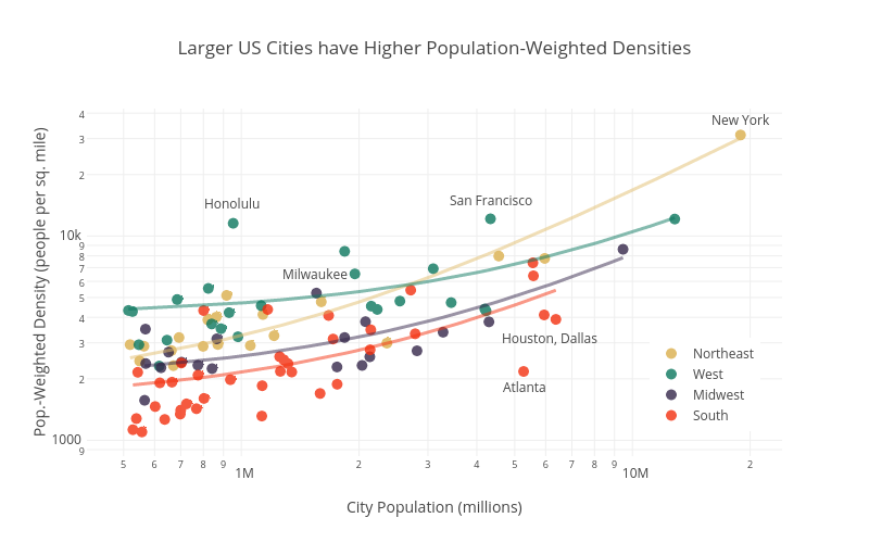
An interesting (if not intuitive) insight from population-weighted density is the strong relationship between city size and density. Big cities are more dense. The plot below shows the population weighted densities and total populations of the 100 U.S. largest cities (well, technically core-based statistical areas). Click on the image for the interaction version if you want to mouse over the dots to identify individual cities.

Larger US Cities have Higher Population-Weighted Densities

Click for interactive version. Note log-log scale.

The cities are categorized by region, showing the general pattern that southern cities are the least dense and northeastern and western cities the most dense. This regional difference is emphasized in the linear fits shown for each region. I was surprised by how dense on average the western cities are. Honolulu is a real outlier in terms of having a high density for its size. Unsurprisingly, the sprawling giants of Atlanta, Dallas, and Houston are low-density outliers.

Incidentally, I got the idea for this graph after listening to a very interesting podcast on Streetsblog about the urban form of Milwaukee. It mentioned that Milwaukee is actually one most the most dense cities for its size, especially when looking in the Midwest. And sure enough, Milwaukee lies well above the blue trend line for Midwest cities. If you have 45 minutes and are interested in Milwaukee you should definitely listen to the podcast. Full disclosure: I was born and raised there.

Technical notes: Plot made with plot.ly using data from U.S. Census. The color palette is inspired by the film Rushmore and is from Karthik Ram’s wesanderson R package. Yes, this was all an elaborate excuse to try out the Wes Anderson color palettes.

A nice in-depth look at urban density and implications for transit can be found here.

Finally, if you are interested in extreme urban density, check this out. I can’t vouch for the accuracy of the data, but the web site name suggests it’s probably pretty legit.

The Rio Declaration and the Decline of Multilateral Environmental Agreements

It’s been quite some time since my last post. I have been busy with a young child, new job, and an international move. But I’m hoping to get back into posting and making visualizations on a regular basis.

The reason for this post is that I came across an interesting resource called the International Environmental Agreements Database Project, hosted at the University of Oregon. The database contains information on about 1100 multilateral environmental agreements (MEAs) dating back to 1857. The data include the title, type (an original agreement or a protocol or amendment to an existing agreement), dates of signature and entry into force, and the parties. For some agreements there is even data on performance as well as coding to allow for comparison of the actual legal components.

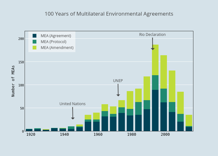
As an initial exploration, I simply looked at how many agreements were concluded over time. The plot below shows the results for the last 100 years. Click for the interactive and shareable plot.ly version.

100 Years of Multilateral Environmental Agreements

Click for interactive version

There is a pretty interesting pattern. From the early 20th century until the 1950s there are not that many MEAs. Then the pace picks up in mid-century, peaking in the early 1990s, and declining considerably after that.

What’s going on? Have all the easy agreements been reached and there is nothing more for countries to negotiate about? Maybe that’s part of it, but I think it has something to do with an event that coincided with the peak in MEAs – The 1992 Earth Summit and the resulting Rio Declaration on Environment and Development.

The Earth Summit was a huge event in the global environmental community, and occurred at a high point of optimism about multilateralism. There was a flurry of MEA activity around this time. But there was also a building movement to ensure that international environmental diplomacy was benefiting the poor, and in particular, developing countries.

The Rio Declaration enshrined the principle of common but differentiated responsibilities. This is the idea that while all nations have a responsibility to protect the global environment, rich nations should shoulder a greater share of the burden.

It is a noble sentiment, and one that in my view makes a lot of sense. But it had the effect of making it more difficult to reach agreements in international environmental negotiations. Developing countries started going into the negotiations expecting more support, in the form of funding, reduced obligations, or technology transfer, from the developed world. Common but differentiated responsibilities is at the root of a major sticking point in global climate talks. Should China, India, and other rapidly developing nations have the same stringent obligations as more mature economies?

I certainly don’t think this is the only cause of the decline in new MEAs in the last 20 years. And neither can I claim to be the first to think about the Rio Declaration’s impact on MEAs. There’s an entire literature on it. For example, Richard Benedick discussed this theme at length in reference to the Montreal Protocol and its aftermath in his book Ozone Diplomacy.

As a final disclaimer, for this analysis it would be best to filter the IEA database to exclude those MEAs that only have a few parties. That way you could really focus on the rate of global or large regional MEAs over time. Perhaps I’ll do that next.

But in any case, it’s an interesting dataset and an interesting pattern. And a good excuse to step back and think about the big picture in global environmental politics.

Hurricanes and Baby Names

Recently there has been bit of buzz about a study claiming that female named hurricanes cause more fatalities, on average, than male ones. The authors suggested that the discrepancy is attributable to gender bias. Female named hurricanes do not seem as threatening to people, so presumably they take fewer precautions. From the start this seemed pretty far-fetched, and in fact a number of problems have been found with the study.

But it got me thinking about hurricane names. A more likely effect of a hurricane’s name would be to discourage parents from giving their children that name, if the hurricane is associated with death and destruction. Fortunately, there is readily available data with which to test this hypothesis. For hurricanes, I used the same data as the hurricane gender study described above (they may have had some problems with their methodology, but at least they released their data). It contains data on 92 Atlantic hurricanes that made landfall in the U.S. since 1950*. For baby names I turned to the Social Security Administration. There is a great R package called babynames that makes the yearly SSA data available in a readily accessible format for use in R. As an aside, the SSA baby names data is the source of all sorts of interesting visualizations and analyses, such as the baby name voyager and this article from fivethirtyeight.com on predicting a person’s age based on their name.

The tricky part of this analysis is deciding how to define a decrease in name usage after a hurricane. The simplest way would be to look at how many times a name was given in the year of a hurricane versus how many times that name was given the following year. For example, how many baby Kartrinas were there in 2005 versus 2006. However, this method does not take into account that most names are either decreasing or increasing in popularity as part of a longer-term trend. So you have to look at how the popularity of a name was changing before the hurricane as well. To see why, look at this plot of the number of babies named Katrina over time.

katrina

Katrina peeked in popularity in in 1980 and has been declining ever since. But from 2004-2005 the number of Katrina’s actually increased about 13%. From 2005-2006, however, it decreased dramatically – by 26%. It’s a pretty good bet that this rapid decrease was due to the hurricane.

To quantify the change in a name’s usage after a hurricane, I made the assumption that the best predictor of how a name’s popularity will change in a given year is how it changed last year. To calculate the post-hurricane change in name usage I subtracted the percent change in name usage in the year before the hurricane from the percent change after the hurricane. In the Katrina example the post hurricane change would be (-26%) – (13%) = -39%. This post-hurricane percent change value is what I use in the analysis below.

Before we get to the results, let’s take at look at the fascinating case of Carla:

carla

Hurricane Carla was an extremely intense storm that hit Texan in 1961, killing 43. The name “Carla” had been surging in popularity,  but after 1961 it started a decline in popularity from which it never recovered. It seems a pretty good bet that the hurricane had a major role in Carla’s decline. Interestingly, the first live television broadcast of a hurricane was of Carla, with a young Dan Rather himself reporting from Galveston. Could the shock of the American TV-viewing public seeing footage of the storm in their living rooms have contributed to the demise of Carla as a name?

Back to the analysis. Indeed, the hurricane baby name effect seems real. After running the numbers, I found that names associated with a landfalling hurricane were about 15 percent less common in the year after the hurricane. Out of the 93 hurricanes in the data set, 65 were associated with a decrease in the popularity of their names, and only 21 were followed by increasing name usage. (Seven hurricane names were not found in the SSA data in their landfall year).

So far this is pretty intuitive. Of course people are less likely to name their dear infant after a natural disaster. Based on this reasoning, you’d expect that the more fatalities caused by a hurricane, the greater the baby name effect. Let’s test that.

names.fatal

The effect is quite small. When we take Katrina out (a massive outlier in terms of fatalities), it’s smaller still:

name.fatal.ex.kat.rug

So the correlation between change in baby name usage and hurricane fatalities is quite weak. Finally, I had to see if the gender of the hurricane name affected this relationship. Were more deadly female-named hurricanes more or less likely than male names to affect baby name popularity? Maybe I’d even find that male baby name usage goes up with hurricane fatalities because parents associate the names with strength? I can see the Slate headline now! Alas, there is no significant difference:

names.fatal.ex.kat.bysex

By the way, there are more female names because from 1950 – 1979 all Atlantic hurricanes were given female names.

There’s an almost endless amount of interesting things to glean from the baby names data. My ultimate dream is an algorithm to determine the perfect name for your baby based on a number of criteria chosen by the expectant parents. It would really take the stress out of the naming process. One of the criteria would certainly be that the name is not on the World Meteorological Association’s list of tropical storm names!

Data and code available on github.

* The authors of the hurricane fatalities study did not include Katrina in their data set. I added it in with data from Wikipedia.


Graphics for Fitness Motivation using Plot.ly

This post is intended to illustrate the cool things you can do with plot.ly’s API for R. Plot.ly is a web-based tool for making interactive graphs. It uses the D3.js visualization library, and lets you create very attractive plots that can be easily shared or embedded in a web page. With the R API you can manipulate data in R and then send it over to plot.ly to create an interactive graph. There’s also a function that let’s you create a plot in R using ggplot2, and then shoot the result directly over to plot.ly (summarized nicely here).

I have great little free app on my iPhone called Pedometer++ that keeps track of how many steps I take each day. I exported the data, plotted up a time series with ggplot2, and used the API to make the graph in plot.ly. It worked quite nicely. The only hiccup was that plot.ly did not recognize the local regression curve, so I had to add that separately.

You can see from the plot that I’m not consistently meeting my 10,000 step goal. In fact, I averaged 7,002 steps over this period. That still comes out to a total of 1,470,463 steps. From October through February my step count was trending slightly downward, but since then it’s picked up. Maybe that had something to do with the cold winter. Hopefully as the weather (and my motivation) improves, I’ll hit my goal.

steps_taken_per_day_october_2014_-_november_2014

Click to see the interactive version

Any here’s a bonus box plot showing steps taken by day of the week (also using the R API):

steps_per_day2c_october_2013_-_may_2014

Click to see the interactive version

If there are any pedometer users out there who are interested, let me know and I can post the code.

Updated Global Mercury Pollution Viz and Graphics

One of the first posts on this blog was about using Tableau to visualize data on global emissions of mercury.  I’ve gotten suggestions from a few people and given the graphic a bit of a face lift. Click on the image to see the interactive viz:

Dashboard_1 (3)

Click for interactive graphic

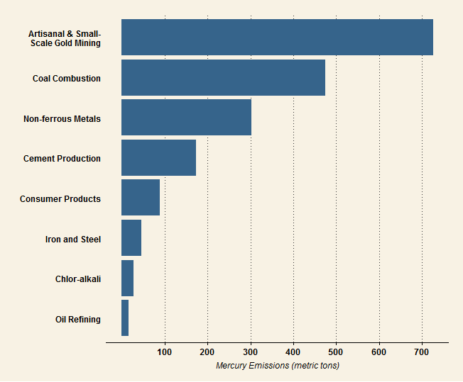
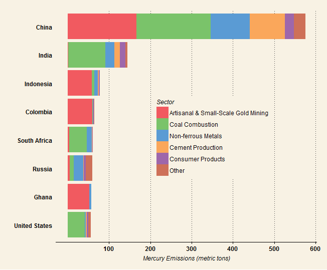
I also used the same dataset to make some static graphics using ggplot2 and the ggthemes package. I’d love any input on how to improve the the look and feel of both these and the Tableau viz. I’ve always found picking good colors very challenging, so thoughts on the palettes are especially welcome.

hg.emissions.bysec

The 8 industry sectors with the highest global mercury emissions. Data for 2010 from the 2013 UNEP Global Mercury Assessment.

hg.emissions.bycty_fewm

Countries with the highest mercury emissions. Data for 2010 from the 2013 UNEP Global Mercury Assessment.

Getting to Know the Worldwide Governance Indicators

A while ago I wrote a post suggesting that Ukraine’s propensity for revolution might have something to do with its high level of government corruption in combination with its relatively well-developed civil society. As evidence for this, I showed that Ukraine (together with Kyrgyzstan and Moldova, two countries that have also recently experienced political unrest) was an outlier among post-Soviet states with respect to the relationship between corruption perceptions and authoritarianism. This finding was interesting, but by no means robust enough to warrant broad generalizations about corruption and democracy and revolution.

Since then, a few others chimed in with some ideas. Ben Jones suggested looking at corruption and authoritarianism in countries that experienced revolutions over time. Cavendish McCay looked at corruption and authoritarianism data from the same sources but over the entire globe, and produced a very cool visualization. He also pointed me to the World Bank’s Worldwide Governance Indicators, which contains measures of democracy, corruption, and political stability. Perhaps it would be possible to test my hypothesis empirically using these data. This could be done for individual regions or for the whole world, and could also have a temporal component (the indicators have been published since 1996).

In order to determine if such an analysis is feasible, I decided to take a closer look at the dataset (which is free and downloadable from the website). The Worldwide Governance Indicators (WGI) project is an ambitious one. The authors compile data from 31 different sources (such as think tanks, NGOs, private firms) and produce annual scores for every country for six indicators of the quality of governance. The indicators are:

  • Voice and Accountability
  • Political Stability and Absence of Violence
  • Government Effectiveness
  • Regulatory Quality
  • Rule of Law
  • Control of Corruption

First off, we can look at the data on a map. Fortunately the WGI website has a series of nice Tableau interactive graphics, including maps:

Screen Shot 2014-04-27 at 2.17.49 PM

Looking at the indicators geographically is helpful. But to evaluate whether they can be used to test the hypothesis, I want to see how each indicator is correlated with all the others. For this, we’ll turn to R. Here is a correlation matrix of the six indicators as calculated for 2012. Positive correlations are reflected as positive values. The closer the the number to one, the stronger the correlation. wgi.corrplot As you can see, all the indicators are positively correlated to each other, some very strongly. This is not surprising. We would expect well-governed countries to get high marks for rule of law, regulatory quality, control of corruption, etc. One interesting observation here is that Control of Corruption actually has the lowest correlations of all the indicators. A scatter plot matrix is a good way to look at the data in more detail:
wbi.splom.plot

The idea for this variation on the scatter plot matrix comes from Winston Chang’s R Graphics Cookbook. Its structure is similar to the correlation matrix in that all of the indicators are plotted against each other. The lower panels show scatter plots with LOESS regression lines for each indicator pair. This plot has some extra bells and whistles thrown in – histograms of the distribution of each in indicator in the diagonal panels and correlation coefficients (just like the correlation matrix) in the upper panels. The scatter plots show the strong to moderate correlations that we already saw in the correlation matrix, but allow us to make out some curious features of the data, like the non-linear relationship between Voice and Accountability and many of the other indicators.

The indicator values are in units of a standard normal distribution. A value of zero is the mean, while a value of one is one standard deviation higher than the mean. Given the distributions,  the indicator values range from about -2.5 to 2.5.  Positive values represent better governance, negative represent worse. Because each indicator is measured on the same scale, we can simply sum all six to determine the overall “best governed” country. The top six are:

Country     sum
FINLAND     11.19
SWEDEN      10.94
NEW ZEALAND 10.83
NORWAY      10.67
DENMARK     10.59
SWITZERLAND 10.57

And the bottom six:

SOMALIA              -13.65
CONGO, DEM. REP.     -9.76
SUDAN                -9.74
SYRIAN ARAB REPUBLIC -9.53
AFGHANISTAN          -9.48
KOREA, DEM. REP.     -9.35

I got a bit carried away examining the correlations between the governance indicators, but in a subsequent post I hope to look closer at the democracy – corruption – stability hypothesis. I’m still not quite sure what statistical tests to use and how to apply them, and I’d welcome any ideas. Data and code are posted on Github (github.com/caluchko/wgi)


Another Way to Look at Mercury in Seafood

In the previous post, I used Tableau Public to create a visualization of the Seafood Hg Database. That graphic showed the mean mercury content and number of samples by seafood category. But there are several other dimensions in the database, including the year of the study and the particular species of seafood sampled. I couldn’t resist playing around with the data a little more, this time using the lattice package in R.

The plot below shows the mean mercury concentration (y-axis) in studies of the 12 seafood categories with the highest median mercury concentration. The x axis shows the date of the study. I’ve also plotted a trend line for each panel. This is a nice way to visualize the data, but I wouldn’t read too much into this plot. For one thing, many of the seafood categories contain multiple species, some of which are higher than others in mercury. Also, this plot does not account for the geographical region where the fish were sampled.

fish.hg.latticeplot
We can tease a little more from the dataset by looking at the individual species within a seafood category. Here is a plot of the six tuna species with the greatest number of studies. The larger species, like bluefin, seem have higher mercury contents than the smaller ones, like skipjack. One curious feature of the dataset is also visible here: there were very few studies of mercury in seafood in the 1980s.
fish.hg.tunaplot