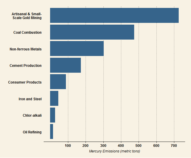
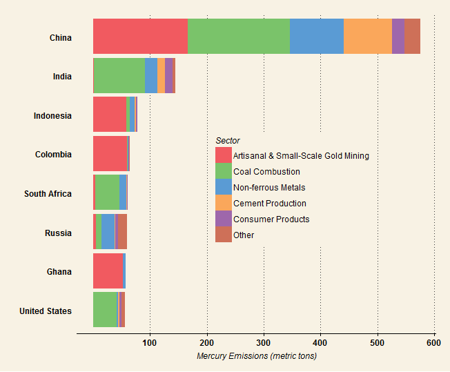
One of the first posts on this blog was about using Tableau to visualize data on global emissions of mercury. I’ve gotten suggestions from a few people and given the graphic a bit of a face lift. Click on the image to see the interactive viz:
I also used the same dataset to make some static graphics using ggplot2 and the ggthemes package. I’d love any input on how to improve the the look and feel of both these and the Tableau viz. I’ve always found picking good colors very challenging, so thoughts on the palettes are especially welcome.


I am color-challenged myself, but I like more muted colors, especially when illustrating a negative like pollution. On the other hand, the banded appearance of the chart showing countries with the most pollution is easy to understand and very informative.