Weighted Density and City Size: Who Knew Milwaukee Is So Dense

You’re probably familiar with the concept of population density. It’s the total population divided by the area. When talking about cities, it’s commonly understood that high population density is a necessary if not sufficient condition for urban vibrancy and efficient mass transit. But it can be difficult to compare population densities of metropolitan areas because the administrative boundaries have an arbitrary effect on measurement. For example, if the LA metro area is defined at the county level and includes all of San Bernardino County, which is mostly empty desert, you get a pretty meaningless density measurement.

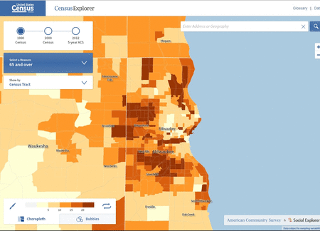
Now, you can look at smaller administrative areas to get a better handle on the population density of a city. In the U.S. the census tract is the highest resolution. With the areas and populations of each census tract, you can calculate an even more interesting metric: population-weighted density, which is the the average of each resident’s census tract density. That means that areas where more people live get more weight in the overall density calculation.

Another way to think about population-weighted density is the density at which the average person lives. The simple population density of the entire U.S. is 87 people per square mile. That really does not tell us much. But the population-weighted density is over 5,000 people per square mile. The average American lives in an urban area. (That example is from a U.S. Census report on metropolitan areas.)

An interesting (if not intuitive) insight from population-weighted density is the strong relationship between city size and density. Big cities are more dense. The plot below shows the population weighted densities and total populations of the 100 U.S. largest cities (well, technically core-based statistical areas). Click on the image for the interaction version if you want to mouse over the dots to identify individual cities.

Larger US Cities have Higher Population-Weighted Densities

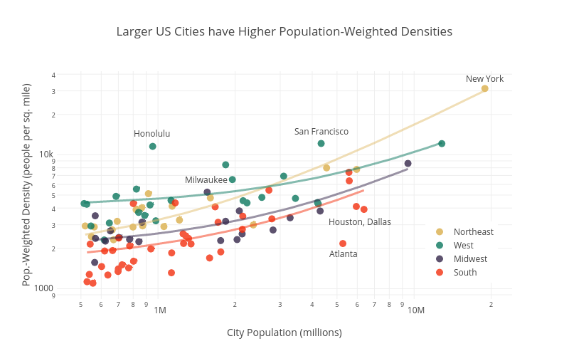
Click for interactive version. Note log-log scale.

The cities are categorized by region, showing the general pattern that southern cities are the least dense and northeastern and western cities the most dense. This regional difference is emphasized in the linear fits shown for each region. I was surprised by how dense on average the western cities are. Honolulu is a real outlier in terms of having a high density for its size. Unsurprisingly, the sprawling giants of Atlanta, Dallas, and Houston are low-density outliers.

Incidentally, I got the idea for this graph after listening to a very interesting podcast on Streetsblog about the urban form of Milwaukee. It mentioned that Milwaukee is actually one most the most dense cities for its size, especially when looking in the Midwest. And sure enough, Milwaukee lies well above the blue trend line for Midwest cities. If you have 45 minutes and are interested in Milwaukee you should definitely listen to the podcast. Full disclosure: I was born and raised there.

Technical notes: Plot made with plot.ly using data from U.S. Census. The color palette is inspired by the film Rushmore and is from Karthik Ram’s wesanderson R package. Yes, this was all an elaborate excuse to try out the Wes Anderson color palettes.

A nice in-depth look at urban density and implications for transit can be found here.

Finally, if you are interested in extreme urban density, check this out. I can’t vouch for the accuracy of the data, but the web site name suggests it’s probably pretty legit.

Advertisement

DIY Animation with Census Explorer

Recently, I attended the ESRI Federal GIS conference here in Washington DC. I was canvassing the vendor exhibits looking for free pens, and maybe, if I was lucky, notebooks, when I came across the U.S. Census Bureau display. The nice people there showed me a very cool tool for viewing basic U.S. demographic data over time and at a variety of spatial scales. It’s called Census Explorer.

I have used Census data before to do some analysis (and write a post) on age and income in U.S. counties, but I had to download the data and map it myself. But Census Explorer is an online map interface. You can zoom from State to census tract level, and toggle between data from 1990, 2000, and 2012.

I zoomed in on the Milwaukee, WI metro area and looked at the percent of population age 65 and over at the census tract level. Toggling from 1990 to 2012, I could make out a clear pattern – the suburbs were becoming older at the expense of the central city – but I had no way to export this as a single image. So I went low tech. I took screenshots of each image, aligned then, and made a GIF using a free online service.

age animation

It’s not perfect, but the demographic change over time is clearly visible. Actually, I was surprised to see such a clear pattern in Milwaukee over the last 22 years. Any idea why this is happening?

Where Do The Elderly Live?

If your own mother does not read your blog, you know it’s time to pack it in. Fortunately, my dear mom is a faithful reader. She works in the geriatric care management industry – basically coordinating medical care for elderly patients – and asked me if I could put together some visualizations of old age in America. I thought it would be a good idea to start with figuring out where exactly older Americans live. This turned out to be a good chance to play with CartoDB and US Census Data. See the end of the post for more details on how I put these maps together, and click on the map images to access the zoomable, clickable CartoDB versions. So here you go mom, this one’s for you.

percent over 65

Percent of Population Over Age 65

About 14 percent of Americans are over age 65. But, as you can see from the map above, they are not evenly distributed across the county. At the county level the percent of residents over 65 varies from 10 percent to almost 50 percent. You can see that the Great Plains, parts of the west,  northern Michigan and Wisconsin, and  Florida all have concentrations of these older counties.

pop over 65 per sqr mile

People over age 65 per square mile

But if we are interested in where the most elderly people live, the percentage of population over 65 is really not the most instructive. After all, many of the counties with high proportions of elderly people are rural counties with low population densities. A more instructive metric would be the number of people over 65 per county per square mile, or the population density of elderly. We can get this by multiplying, in each county, the percent of people over 65 by the total population density. That’s what the map above shows. It looks a lot different than the map of elderly population by percent. You can see that even though areas like the northeast corridor (Washington DC – Boston) do not have an especially large share of elderly residents, the elderly population density is high simply because the total population density is high.  Perhaps the most obvious conclusion we can draw from this map is that there are an awful lot of elderly people in the state of Florida.

old dense poor

Counties with over 25 people over age 65 per square mile and median household income over $50,000

Finally, as an illustration of the sort of things you can do with CartoDB, I made a map (above) that shows counties with relatively high densities of elderly residents and below average median household incomes (click on the image and zoom in to see the smaller urban counties). This might be useful if you were interested in areas where social services for the elderly might be best directed.

Technical Notes: Finally, just a word or two about how I made these maps. First, I downloaded data from the U.S. Census QuickFacts service. With these data you can produce an Excel spreadsheet with county-level attributes on demographics, race, poverty and incomes, and business. I generated another column of population density of residents over 65. Next, I downloaded a shapefile of U.S. counties with state and county FIPS codes. I uploaded both of these into CartoDB and joined the tables by matching the numeric FIPS codes. Finally, I used CartoDBs widgets and filters to produce the chloropleth maps above. To see the maps in CartoDB, click on the images. Click on individual counties to see selected demographic and economic attributes for that county.