Recently, I attended the ESRI Federal GIS conference here in Washington DC. I was canvassing the vendor exhibits looking for free pens, and maybe, if I was lucky, notebooks, when I came across the U.S. Census Bureau display. The nice people there showed me a very cool tool for viewing basic U.S. demographic data over time and at a variety of spatial scales. It’s called Census Explorer.
I have used Census data before to do some analysis (and write a post) on age and income in U.S. counties, but I had to download the data and map it myself. But Census Explorer is an online map interface. You can zoom from State to census tract level, and toggle between data from 1990, 2000, and 2012.
I zoomed in on the Milwaukee, WI metro area and looked at the percent of population age 65 and over at the census tract level. Toggling from 1990 to 2012, I could make out a clear pattern – the suburbs were becoming older at the expense of the central city – but I had no way to export this as a single image. So I went low tech. I took screenshots of each image, aligned then, and made a GIF using a free online service.
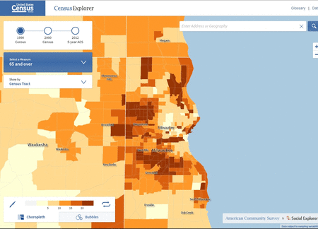
It’s not perfect, but the demographic change over time is clearly visible. Actually, I was surprised to see such a clear pattern in Milwaukee over the last 22 years. Any idea why this is happening?
