The Rio Declaration and the Decline of Multilateral Environmental Agreements

It’s been quite some time since my last post. I have been busy with a young child, new job, and an international move. But I’m hoping to get back into posting and making visualizations on a regular basis.

The reason for this post is that I came across an interesting resource called the International Environmental Agreements Database Project, hosted at the University of Oregon. The database contains information on about 1100 multilateral environmental agreements (MEAs) dating back to 1857. The data include the title, type (an original agreement or a protocol or amendment to an existing agreement), dates of signature and entry into force, and the parties. For some agreements there is even data on performance as well as coding to allow for comparison of the actual legal components.

As an initial exploration, I simply looked at how many agreements were concluded over time. The plot below shows the results for the last 100 years. Click for the interactive and shareable plot.ly version.

100 Years of Multilateral Environmental Agreements

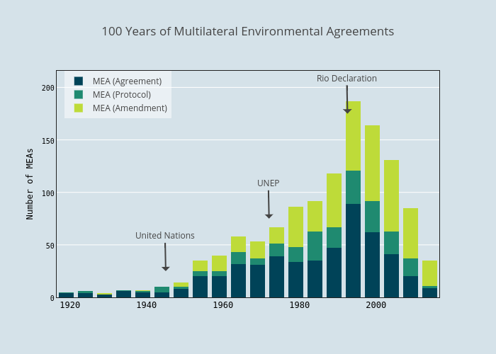
Click for interactive version

There is a pretty interesting pattern. From the early 20th century until the 1950s there are not that many MEAs. Then the pace picks up in mid-century, peaking in the early 1990s, and declining considerably after that.

What’s going on? Have all the easy agreements been reached and there is nothing more for countries to negotiate about? Maybe that’s part of it, but I think it has something to do with an event that coincided with the peak in MEAs – The 1992 Earth Summit and the resulting Rio Declaration on Environment and Development.

The Earth Summit was a huge event in the global environmental community, and occurred at a high point of optimism about multilateralism. There was a flurry of MEA activity around this time. But there was also a building movement to ensure that international environmental diplomacy was benefiting the poor, and in particular, developing countries.

The Rio Declaration enshrined the principle of common but differentiated responsibilities. This is the idea that while all nations have a responsibility to protect the global environment, rich nations should shoulder a greater share of the burden.

It is a noble sentiment, and one that in my view makes a lot of sense. But it had the effect of making it more difficult to reach agreements in international environmental negotiations. Developing countries started going into the negotiations expecting more support, in the form of funding, reduced obligations, or technology transfer, from the developed world. Common but differentiated responsibilities is at the root of a major sticking point in global climate talks. Should China, India, and other rapidly developing nations have the same stringent obligations as more mature economies?

I certainly don’t think this is the only cause of the decline in new MEAs in the last 20 years. And neither can I claim to be the first to think about the Rio Declaration’s impact on MEAs. There’s an entire literature on it. For example, Richard Benedick discussed this theme at length in reference to the Montreal Protocol and its aftermath in his book Ozone Diplomacy.

As a final disclaimer, for this analysis it would be best to filter the IEA database to exclude those MEAs that only have a few parties. That way you could really focus on the rate of global or large regional MEAs over time. Perhaps I’ll do that next.

But in any case, it’s an interesting dataset and an interesting pattern. And a good excuse to step back and think about the big picture in global environmental politics.

Global Carbon Emissions in Graphs

The great Polar Vortex of 2014 has captured the nation’s imagination. That doesn’t mean we can’t take a look at the state of the world’s greenhouse gas emissions. In fact, there is nothing dissonant at all about climate change and cold snaps.

There is a ton of great data and material available on greenhouse gases and climate change, but one very useful resource for visualizing anthropogenic carbon emissions is the Global Carbon Project’s 2013 Global Carbon Budget. In some ways the information presented in the report is quite basic. But when looking at the latest climate models and their implications for extreme weather, or analysis of the predicted impacts of climate change a particular ecosystem or populated area, it’s easy to lose track of the simple truth of just how much carbon humans are releasing into the atmosphere. I think it’s worth taking a look at the entire Global Carbon Budget, but here are just a few graphs that I think are simple yet illustrative.

co2 emissions growth per year

Global CO2 emissions from fossil fuel burning and cement production, gigatons carbon per year.

The plot above shows how much carbon is released each year from fossil fuel burning and cement production. So what does it tell us? Well, first of all the amount of carbon emissions is increasing every year. It’s important to note that even if carbon emissions stopped growing tomorrow, the amount of carbon in the atmosphere would continue increasing. This can be best understood by the bathtub analogy.

Not only is the amount of emissions increasing every year (with the exception of the global financial crisis), but for most of the time period the rate of increase was increasing. This is not good.

Finally, there’s a kink in the slope of the graph around 2002. What’s going on there?

countries co2 per year

CO2 emissions from fossil fuel burning and cement production in selected countries, gigatons carbon per year.

And here we have the answer. Starting in the early 2000s, China began a period of explosive economic growth and infrastructure development, and carbon emissions increased as a result. Much of the increase in Chinese carbon emissions is due to coal-fired power plants, but cement production and petroleum also played a part. Sometime around 2006 China surpassed the U.S. as the world’s largest carbon emitter (although on a per capita basis the U.S. still releases a much larger amount of greenhouse gases). From 2011-2012 Chinese carbon emissions grew almost 6%, while U.S. and European emissions actually decreased.

historic cumulative emissions

Cumulative Global CO2 emissions for selected countries and regions over time

One common argument you will hear at international climate change negotiations is that rich countries, like the U.S. and EU nations, are responsible for the majority of historic cumulative carbon emissions and should therefore bear a larger share of the responsibility of mitigation of and adaptation to climate change. And while the premise of this argument – that a small set of rich countries is responsible for most of the carbon that has been emitted into the atmosphere – is true,  it is changing. 

Take a look at the graph above. You can see that 140 years ago the majority of carbon from fossil fuel burning in the atmosphere was from Europe. That makes sense. The industrial revolution began there and Europe was still the most highly industrialized region on earth. By 1960, the U.S. was responsible for a bit more than 40% of the total historic anthropogenic carbon emitted to the atmosphere, and Europe about an equal amount. The rest of the world had contributed less than 20% of cumulative emissions. But today, the U.S. and Europe are responsible for 50% of cumulative emissions, and countries like China and India are rapidly increasing their cumulative total. So this argument may lose its appeal for some countries if current trends persist.