You’re probably familiar with the concept of population density. It’s the total population divided by the area. When talking about cities, it’s commonly understood that high population density is a necessary if not sufficient condition for urban vibrancy and efficient mass transit. But it can be difficult to compare population densities of metropolitan areas because the administrative boundaries have an arbitrary effect on measurement. For example, if the LA metro area is defined at the county level and includes all of San Bernardino County, which is mostly empty desert, you get a pretty meaningless density measurement.
Now, you can look at smaller administrative areas to get a better handle on the population density of a city. In the U.S. the census tract is the highest resolution. With the areas and populations of each census tract, you can calculate an even more interesting metric: population-weighted density, which is the the average of each resident’s census tract density. That means that areas where more people live get more weight in the overall density calculation.
Another way to think about population-weighted density is the density at which the average person lives. The simple population density of the entire U.S. is 87 people per square mile. That really does not tell us much. But the population-weighted density is over 5,000 people per square mile. The average American lives in an urban area. (That example is from a U.S. Census report on metropolitan areas.)
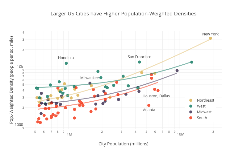
An interesting (if not intuitive) insight from population-weighted density is the strong relationship between city size and density. Big cities are more dense. The plot below shows the population weighted densities and total populations of the 100 U.S. largest cities (well, technically core-based statistical areas). Click on the image for the interaction version if you want to mouse over the dots to identify individual cities.
The cities are categorized by region, showing the general pattern that southern cities are the least dense and northeastern and western cities the most dense. This regional difference is emphasized in the linear fits shown for each region. I was surprised by how dense on average the western cities are. Honolulu is a real outlier in terms of having a high density for its size. Unsurprisingly, the sprawling giants of Atlanta, Dallas, and Houston are low-density outliers.
Incidentally, I got the idea for this graph after listening to a very interesting podcast on Streetsblog about the urban form of Milwaukee. It mentioned that Milwaukee is actually one most the most dense cities for its size, especially when looking in the Midwest. And sure enough, Milwaukee lies well above the blue trend line for Midwest cities. If you have 45 minutes and are interested in Milwaukee you should definitely listen to the podcast. Full disclosure: I was born and raised there.
Technical notes: Plot made with plot.ly using data from U.S. Census. The color palette is inspired by the film Rushmore and is from Karthik Ram’s wesanderson R package. Yes, this was all an elaborate excuse to try out the Wes Anderson color palettes.
A nice in-depth look at urban density and implications for transit can be found here.
Finally, if you are interested in extreme urban density, check this out. I can’t vouch for the accuracy of the data, but the web site name suggests it’s probably pretty legit.

