One Chart that Explains Why Ukraine was Vulnerable to Revolution

After months of protests, Ukraine slipped into violence last week as government forces attacked protesters in Kyiv. Then, in a frantic 48 hours, President Viktor Yanukovych’s government collapsed, rival politician Yulia Timoshenko was released from prison, and Yakukovych fled into hiding.  It was a stunning victory for the “maidanovtsi”, those protesting on Kyiv’s Maidan and those supporting the protesters around the county and the world.

I’m reading Bruce Bueno de Mesquita’s The Predictioneer’s Game, which is about analyzing incentives to make political forecasts. This book got me thinking about Ukraine. Why did Yanukovych fall? Sure, he was corrupt, but so are many leaders in the region.

What happened in Ukraine was very complex. But it seems to me that at a basic level, the obvious corruption of the Yakukovych government,  combined with Ukraine’s relatively open and democratic society, led to an unstable situation.

To test this intuition, I looked at data from The Economist’s Democracy Index and Transparency International’s Corruption Perception Index. This plot shows where the former Soviet republics fit on the corruption – authoritarianism plane (click on the image for interactive version):

demo cor2

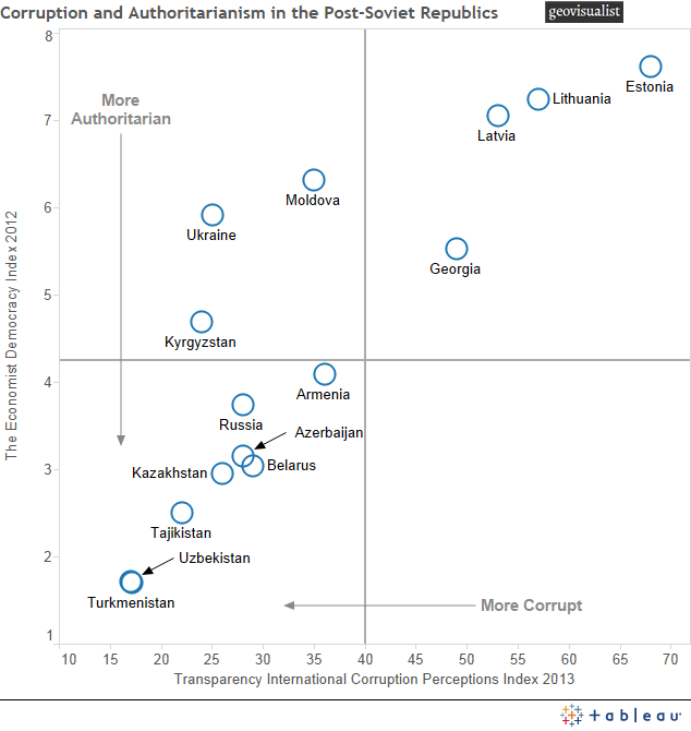
It is instructive to divide this plot into quadrants. The lower left quadrant shows those countries that are both very corrupt and authoritarian. These governments have survived very high levels of corruption in part because they resort to anti-democratic means of staying in power, such as restricting citizens’ political and civil rights.

The upper right quadrant contains nations with lower levels of corruption and authoritarianism. Chief among these are the Baltic states, which have enjoyed a high degree of stability. Georgia, although it experienced a revolution in 2003, has been more politically stable in recent years.

The lower right quadrant is a null set. We just don’t see countries that are very authoritarian but not very corrupt in this region. An example of a non-Eurasian country that sits in this quadrant would be the United Arab Emirates.

And then there’s the upper left quadrant: states that are less authoritarian but have high levels of corruption. Countries occupying this space have experienced lots of political instability. Kyrgyzstan has had two revolutions in the last decade: the Tulip Revolution of 2005, and the more violent second Kyrgyz revolution in 2010. Moldova suffered widespread unrest in 2009 (the so-called Twitter Revolution), although recent trends point to a more democratic and pro-European direction. And Ukraine had the Orange Revolution in 2004 before the political order was upended again last week as a result of Euromaidan.

Of course, there are many other factors that determine how likely a government is to fall. Economic growth and inequality surely play a part, as do the personalities and governing styles of individual leaders. Yakukovych, for example, was indecisive and incompetent, and many of his allies quickly abandoned him.

So what are the lessons here? Well, if you are going to blatantly siphon money away from your constituents while ignoring many of their basic needs, you better rule with an iron fist. If not, they are going to rise up and throw you out. Or better yet, don’t run a corrupt regime in the first place.

The events in Ukraine illustrate how a relatively democratic society, with a strong civil society and a (mostly) free press can be an important check on corruption in government. Although far from being “fully democratic” in the eyes of international indices, Ukraine was democratic and open enough for Euromaidan to take root and ultimately succeed.

From Miracle Metal to Global Health Risk: A 100-Year History of Mercury Prices and Production

I want to write a series of posts about mercury production, prices, and trade. Although this may seem like a rather esoteric subject, I hope to convince readers that it’s actually pretty interesting. I have a professional interest in mercury as a global pollutant, having worked on negotiations for the Minamata Convention. These posts will also be good opportunity to practice data manipulation, graphics, and analysis in R, a powerful programming language for statistical computing.

Mercury is a pretty amazing substance. It’s the only metal that is a liquid at room temperature, a property that has long been a source of fascination to people, and led to a wide range of applications in industry. Unfortunately, mercury is also a toxin that has harmful effects on both people and the environment.

In this post I’ll examine the price and global production of mercury over the last hundred years or so using data from the U.S. Geological Survey. First, let’s look at the price of mercury in constant 1998 dollars since 1900:

mercury price

You can see that prices have fluctuated quite a bit. Let’s examine the three prominent peaks in the time series and try to figure out what caused them. Now, high prices could mean increased demand, tight supply, or a combination of both. We need to look at global mercury production over the same time period to help shed light on the variations in mercury price:
global mercury production
The first price peak occurred in the late 19-teens, around the time of WWI. In fact, I would posit that it is a direct consequence of WWI. Mercury fulminate is an explosive compound that was commonly used in the last century as a primer for small arms ammunition. They probably used a lot of it during the First World War.

Incidentally, you may recognize mercury fulminate from the TV show Breaking Bad. Walt made some and used it to blow up a group of rival drug dealers. There’s even a MythBusters segment about it.

The second price spike occurred during WWII. This was likely a result of increased demand for use in fulminate explosives, and perhaps in switches and other such products for wartime equipment. Mercury production actually increased quite a bit during the war, but it was apparently not enough prevent high prices. In response to the German invasion, the Soviets moved their main center of mercury production from Nikitovka in Ukraine to Khaidarkan in Kyrgyzstan. I’ll talk about both of these places in a later post.

The last price peak occurred in the 1960s. The causes are a bit more complex. My guess is that a combination of industrial and military uses were driving up demand, and production, although increasing, could not keep up. During this time the United States was building up its national defense reserves of mercury, and other countries were probably doing the same. One defense-related use of mercury was to separate lithium isotopes for use in hydrogen bombs. Hundreds of tons of mercury were spilled at Oak Ridge National Laboratory during isotope separation, and environmental contamination remains to this day. Another use of mercury that never came to be was as a coolant (to replace water) for nuclear reactors.

These were heady days in the mercury business, before the human health and environmental impacts were widely know. This fascinating newsreel from 1955 gives you a flavor of what the times were like:

Mercury prices (and production) started dropping in the 1970s as alternatives to industrial uses were found and the health risks started to become clear. But prices have been growing rapidly in recent years. In the next post I’m going to examine this and look at the degree to which artisanal gold mining might be responsible.

DIY Animation with Census Explorer

Recently, I attended the ESRI Federal GIS conference here in Washington DC. I was canvassing the vendor exhibits looking for free pens, and maybe, if I was lucky, notebooks, when I came across the U.S. Census Bureau display. The nice people there showed me a very cool tool for viewing basic U.S. demographic data over time and at a variety of spatial scales. It’s called Census Explorer.

I have used Census data before to do some analysis (and write a post) on age and income in U.S. counties, but I had to download the data and map it myself. But Census Explorer is an online map interface. You can zoom from State to census tract level, and toggle between data from 1990, 2000, and 2012.

I zoomed in on the Milwaukee, WI metro area and looked at the percent of population age 65 and over at the census tract level. Toggling from 1990 to 2012, I could make out a clear pattern – the suburbs were becoming older at the expense of the central city – but I had no way to export this as a single image. So I went low tech. I took screenshots of each image, aligned then, and made a GIF using a free online service.

age animation

It’s not perfect, but the demographic change over time is clearly visible. Actually, I was surprised to see such a clear pattern in Milwaukee over the last 22 years. Any idea why this is happening?

Global Map of (In)tolerance

The Winter Olympics in Sochi begin today. I hope the games are safe and successful, and I also hope they serve to shine a global spotlight on anti-gay attitudes and policies in Russia.

On that note, the Martin Prosperity Institute has put together this map showing the percentage of populations surveyed who believe their country is a good place to be gay or lesbian.

Click to read about how this map was made

By Martin Prosperity Institute. Click to read about how this map was made

The authors also compared these findings with national economic and social indicators, and found that tolerance of homosexuality is correlated with all sorts of good things. For example, the correlation with economic output per person is 0.72. That’s pretty high. It’s interesting to think about why this is, and whether there is causality involved, and, if so, which way(s) it go(es). Something to ponder during the figure skating.