If you’ve been anywhere near the internets recently you know that animated gifs are ubiquitous. Never one to miss a trend, I decided to make an animated gif – of a map of course. Actually, gifs can be a good way to show movement in maps and charts. Here are some nice examples and tips.
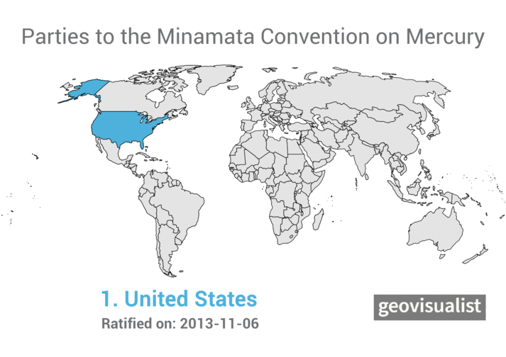
The animation shows which countries are Parties to the Minamata Convention. They appear in order of ratification.
The inspiration and method for this animation came from Alasdair Rae:
Alasdair wrote a useful tutorial on how to use QGIS to create amimated map “geogifs”. I’d been looking for an excuse to play around with QGIS (a free desktop GIS application) for a while. In general I found QGIS quite easy to use and feature-rich. My only complaint is not limited to QGIS but applies to all graphical user interface apps. While they are much easier to get started with, they lack the ability to create a reproducible workflow. If I had to make the map again from another dataset I’d have to remember and recreate all the pointing and clicking I did to make the first map. Whereas with something like R one could write a script and use it to reproduce future maps. But perhaps there are some features in QGIS that I am unaware of that could help with reproduciblity.
Data for the map came from my existing Minamata Convention map on CARTO. I exported the shapefile and used it to create the layers in QGIS. My approach differed a bit from Alasdair’s because in my map not all the polygons are highlighed, only the countries that have ratified.
Incidentally, I was not able to create this animation in CARTO because it only allows animation for points, and I needed to show polygons (country borders).
After exporting 84 frames I used gifmaker.me to make the gif rather than the GIMP or Photoshop. Worked just fine.
This map shows the current status of ratifications of the Minamata Convention on Mercury. Although I update it frequently, check mercuryconvention.org for the most recent status. The map also shows countries engaged in Minamata initial assessment (MIA) and artisanal and small-scale gold mining national action plan (NAP) projects funded by the Global Environment Facility (GEF), along with the implementing agencies. Use the “Visible layers” function on the map to toggle between ratification status, MIAs, and NAPs. The full screen button, located below the zoom controls, is also useful.
Data on ratification and GEF project status from the Interim Secretariat of the Minamata Convention and UNEP. Country boundaries from Natural Earth. Mapping done in CartoDB using Robinson projection.
It’s been quite some time since my last post. I have been busy with a young child, new job, and an international move. But I’m hoping to get back into posting and making visualizations on a regular basis.
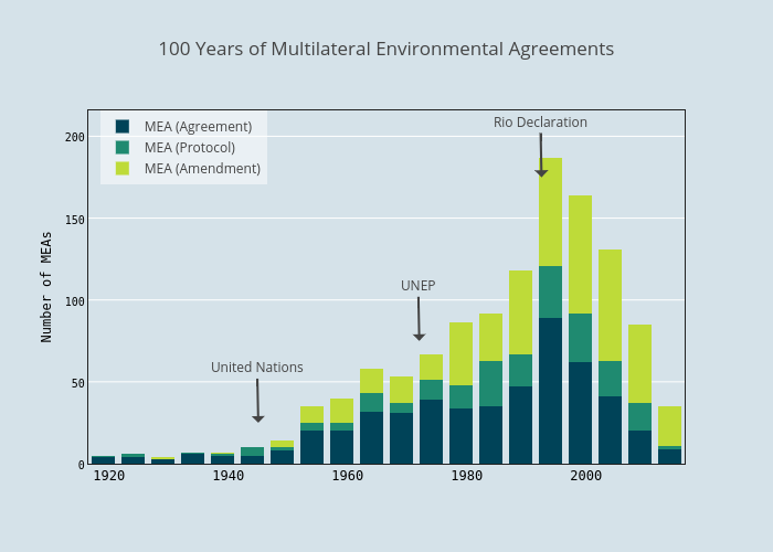
The reason for this post is that I came across an interesting resource called the International Environmental Agreements Database Project, hosted at the University of Oregon. The database contains information on about 1100 multilateral environmental agreements (MEAs) dating back to 1857. The data include the title, type (an original agreement or a protocol or amendment to an existing agreement), dates of signature and entry into force, and the parties. For some agreements there is even data on performance as well as coding to allow for comparison of the actual legal components.
As an initial exploration, I simply looked at how many agreements were concluded over time. The plot below shows the results for the last 100 years. Click for the interactive and shareable plot.ly version.
Click for interactive version
There is a pretty interesting pattern. From the early 20th century until the 1950s there are not that many MEAs. Then the pace picks up in mid-century, peaking in the early 1990s, and declining considerably after that.
What’s going on? Have all the easy agreements been reached and there is nothing more for countries to negotiate about? Maybe that’s part of it, but I think it has something to do with an event that coincided with the peak in MEAs – The 1992 Earth Summit and the resulting Rio Declaration on Environment and Development.
The Earth Summit was a huge event in the global environmental community, and occurred at a high point of optimism about multilateralism. There was a flurry of MEA activity around this time. But there was also a building movement to ensure that international environmental diplomacy was benefiting the poor, and in particular, developing countries.
The Rio Declaration enshrined the principle of common but differentiated responsibilities. This is the idea that while all nations have a responsibility to protect the global environment, rich nations should shoulder a greater share of the burden.
It is a noble sentiment, and one that in my view makes a lot of sense. But it had the effect of making it more difficult to reach agreements in international environmental negotiations. Developing countries started going into the negotiations expecting more support, in the form of funding, reduced obligations, or technology transfer, from the developed world. Common but differentiated responsibilities is at the root of a major sticking point in global climate talks. Should China, India, and other rapidly developing nations have the same stringent obligations as more mature economies?
I certainly don’t think this is the only cause of the decline in new MEAs in the last 20 years. And neither can I claim to be the first to think about the Rio Declaration’s impact on MEAs. There’s an entire literature on it. For example, Richard Benedick discussed this theme at length in reference to the Montreal Protocol and its aftermath in his book Ozone Diplomacy.
As a final disclaimer, for this analysis it would be best to filter the IEA database to exclude those MEAs that only have a few parties. That way you could really focus on the rate of global or large regional MEAs over time. Perhaps I’ll do that next.
But in any case, it’s an interesting dataset and an interesting pattern. And a good excuse to step back and think about the big picture in global environmental politics.
I want to write a series of posts about mercury production, prices, and trade. Although this may seem like a rather esoteric subject, I hope to convince readers that it’s actually pretty interesting. I have a professional interest in mercury as a global pollutant, having worked on negotiations for the Minamata Convention. These posts will also be good opportunity to practice data manipulation, graphics, and analysis in R, a powerful programming language for statistical computing.
Mercury is a pretty amazing substance. It’s the only metal that is a liquid at room temperature, a property that has long been a source of fascination to people, and led to a wide range of applications in industry. Unfortunately, mercury is also a toxin that has harmful effects on both people and the environment.
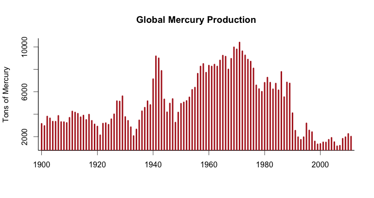
In this post I’ll examine the price and global production of mercury over the last hundred years or so using data from the U.S. Geological Survey. First, let’s look at the price of mercury in constant 1998 dollars since 1900:
You can see that prices have fluctuated quite a bit. Let’s examine the three prominent peaks in the time series and try to figure out what caused them. Now, high prices could mean increased demand, tight supply, or a combination of both. We need to look at global mercury production over the same time period to help shed light on the variations in mercury price:
The first price peak occurred in the late 19-teens, around the time of WWI. In fact, I would posit that it is a direct consequence of WWI. Mercury fulminate is an explosive compound that was commonly used in the last century as a primer for small arms ammunition. They probably used a lot of it during the First World War.
Incidentally, you may recognize mercury fulminate from the TV show Breaking Bad. Walt made some and used it to blow up a group of rival drug dealers. There’s even a MythBusters segment about it.
The second price spike occurred during WWII. This was likely a result of increased demand for use in fulminate explosives, and perhaps in switches and other such products for wartime equipment. Mercury production actually increased quite a bit during the war, but it was apparently not enough prevent high prices. In response to the German invasion, the Soviets moved their main center of mercury production from Nikitovka in Ukraine to Khaidarkan in Kyrgyzstan. I’ll talk about both of these places in a later post.
The last price peak occurred in the 1960s. The causes are a bit more complex. My guess is that a combination of industrial and military uses were driving up demand, and production, although increasing, could not keep up. During this time the United States was building up its national defense reserves of mercury, and other countries were probably doing the same. One defense-related use of mercury was to separate lithium isotopes for use in hydrogen bombs. Hundreds of tons of mercury were spilled at Oak Ridge National Laboratory during isotope separation, and environmental contamination remains to this day. Another use of mercury that never came to be was as a coolant (to replace water) for nuclear reactors.
These were heady days in the mercury business, before the human health and environmental impacts were widely know. This fascinating newsreel from 1955 gives you a flavor of what the times were like:
Mercury prices (and production) started dropping in the 1970s as alternatives to industrial uses were found and the health risks started to become clear. But prices have been growing rapidly in recent years. In the next post I’m going to examine this and look at the degree to which artisanal gold mining might be responsible.
I’m not usually a fan of word clouds. They’re flashy but don’t really tell you much, and they seem like a pretty lazy analysis that you do if you don’t know what else to say about a text. Having said that…this word cloud is actually pretty cool. The text is the Minamata Convention on Mercury and it was produced on wordle.com. It’s a visually pleasing color scheme and layout, but of course the real reason I like it is because the text is very close to my heart, as I’ve spend the last several years negotiating it together with 140 other governments. I like the idea that a text that represents such a huge amount of collective effort on the part of hundreds of people around the world can be represented in a little graphic like this.