What if Ukraine split in two?

If you’re interested in Ukraine, you are probably aware of the country’s east-west political and enthno-linguistic divisions. I wrote about this in a couple of recent posts. Not long ago, I began to wonder what Ukraine would look like if it split into two nations. Now, I don’t think this is going to happen, nor do I think it would be in the best interest of Ukraine. But with protests continuing in Kyiv and in many of  the regions, it’s worth investigating what these two hypothetical nations would look like.

For this exercise, I used data on Ukraine’s oblasts (regions) that I had gathered for an earlier post, and plugged them into Tableau Public. First, I had to decide where to put the new border. I took the vote shares for Yanukovych in the 2010 elections for each region and plotted them in ascending order:

two ukraines vote share

There is a sharp break where the vote share jumps to above 50% – a natural place for the division. Incidentally, it is interesting and unexpected that Zakarpatskaya region, in the far west of the country, had the highest level of Yanukovych support of all the Timoshenko-majority regions. What is going on there?

Transferring that division to the map produces the following result:

two ukraines map2

Let’s look at the key features of these two imaginary countries:

two ukraines table

West Ukraine is a bit larger, and has a slightly higher population – ~24 million versus ~21 million. It’s landlocked, and shares borders with all of Ukraine’s current neighbors. East Ukraine has a higher per capita income, and occupies  all of Ukraine’s Black Sea Coast.

Sheet 6

The chart above illustrates some additional features of the countries. East Ukraine is much more urban than the west, and contains many more Russian speakers (although it has a large minority of Ukrainian speakers). West Ukraine has a much smaller minority of Russian speakers.

I encourage you to take a look at the entire interactive visualization in Tableau by clicking on the image below.

Dashboard_1

Amazingly Detailed Map of the Struggle in Kyiv

Here is an incredibly detailed map of the situation in Kyiv as of January 27. It comes from Dmitri Bortman and was published on Ilya Varlamov’s livejournal page, which has lots of on-the-ground details about what is happening on the Maidan (central square and environs) in Kyiv. If you want to read about what it’s actually like in Kyiv right now and see some amazing pictures, have a look at this recent post by Varlamov.

Basically the reddish shading shows the area occupied by the protesters, and the blue shading shows land occupied by government police forces. The red lines show barricades built by the protesters to keep riot police from clearing the demonstrations. The red dots give an idea of the density of clusters of protesters. Here’s the legend.

These Visualizations Will Spice Up Your Football Viewing this Weekend

Millions of Americans and a few dozen people from other regions of the globe will sit down this weekend to watch the NFC and AFC Championship games. Both games should be pretty good, but no matter how interesting they are, you’ll still need something to do during the commercials besides go for chips and beer and bathroom breaks. I’ll share with you two companions that I plan to have with me during the games. And they both involve attractive visualizations.

The first is the New York Times 4th Down Bot. This is a web site that compares every 4th down situation in the game with a model developed by Brian Burke of AdvancedNFLStats.com. The Bot will then tell you whether the coach should choose to go for it, punt, or kick a field goal. The model was built from 10 years worth of football statistics and calculates how each decision impacts the number of expected points for that team. The idea is that coaches should be trying to maximize expected points (how many points they score minus how many points the other team scores) when the make their 4th down decision. This sounds incredibly obvious but according to the 4th Down Bot coaches are much more conservative than the model would predict.

For example, look at the graphic below. For each position on the field and 4th down distance to go, the graphic shows what decision would maximize expected points. If you are on the opponents 20 yard line and it’s 4th and 15, you should kick the field goal. So far so good. But look at what the model recommends for 4th and 1 at your own 11 yard line. It says you should go for it! I don’t think there’s ever been an NFL coach who’s gone for it in that situation, unless it’s very late in the game and you’re behind. You can see how much more conservative actual coaches are by looking at the right side of the graphic.

4th down

Click on the image to view the interactive version and learn more about the model used to develop it

One explanation that’s commonly given for this discrepancy is that coaches are not simply trying to maximize the chances of winning. They are also risk averse and fear making a controversial decision to go for it, which, if it fails, would incite the rage of the fans and media. There is something to this, but I don’t think it can explain the whole phenomenon. You would think that a maverick coach who starts going for it on 4th and 1 deep in his own territory would eventually start winning more games, and other coaches would feel safer and start copying him.

So I don’t know why coaches seem to play more conservatively than models would suggest they should. But as a fan I can say that intuitively I do think my team should go for it more often on 4th.

It’s fun to watch the game, and when a 4th down comes up, pretend you’re the coach and decide what to do. Then check what the Bot says. You can follow it on twitter at @NYT4thDownBot .

The second tool is seismic analysis of the vibrations caused by the crowd at the Seattle Seahawks stadium. The Pacific Northwest Seismic Network installed three seismometers under the stadium, which is legendary for its crowd noise. They are planning to make near real-time seismographs available during the NFC Championship game, so you can follow all the action during the game. If you’re a Seahawks fan, but you get too nervous to watch the game, you can just wait until you see a big spike in the seismometer, and then turn on the game to watch the replay.

We know that it is possible to pick up seismic waves produced by the roar of the crowd in Seattle because of the famous Beast Quake. This event was measured during Marshawn Lynch’s ridiculous touchdown run against the Saints in the 2011 playoffs. Here it is:

beast quake

GET OFF ME!

And here’s the run:

Have We Already Reached Peak Whisker?

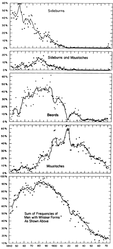
Courtesy of the Nathan Yau’s Flowing Data blog, here is a fascinating look at the prevalence of different types of facial hair from 1840 through the early 1970s:

This is so interesting! I naively assumed that male facial hair fashions came and went through the decades, but here you can plainly see that whiskers have been on a secular decline since a peak that occurred in about 1885. What happened? Was it an improvement of razor technology? Indoor plumbing? It’s incredible that almost 100% of men had facial hair at the turn of the century.

Other mysteries beckon. What’s going on with mustaches in the 19-teens? They shoot up to a peak and then decline almost as quickly. Does this have anything to do with Charlie Chaplin?

And how were these data collected? The only way I can think of is by analyzing old photographs. But wouldn’t that introduce a selection bias? Also, are these data from the U.S.? Europe? What would a worldwide whisker time series look like?

This graph comes from a scholarly article, and I’m sure  it sheds some light on these questions. But I have not read it. As interesting as it must be, I just don’t have time to read journal articles about facial hair.

Finally, there’s the question about what has happened since the 1970s when this was published. We all know that beards are enjoying a bit of a fashion renaissance (although I do suspect that their popularity has reached an inflection point, if not a local maximum). But do they approach the lofty highs of the 1890s?

Maybe in Portland:

Google Charts Fever

Are you totally over Microsoft Excel? Sure, it can be useful, but it’s too clunky for most users and the graphs look pretty ugly. There is another way. You can use Google Sheets, the spreadsheet cousin of Google Docs, for free and on the cloud. Graphs are much more intuitive to create and edit, and they look much better. And you can easily share links or embed to a website. I decided to try it with some data from a certain sick toddler.

This graph shows the child’s temperature over a ~30 hour period. As you can see, he was running a moderate fever. Doses of the fever reducers Tylenol and Motrin are shown, which clearly bring his temperature down to normal levels before they wear off. Perhaps it’s wishful thinking, but I detect a slight pattern of improvement – the maximum temperatures grow slightly lower with each peak.

One good thing with embedding a Google Chart is that it will automatically update on the web when you add new data. If the fever continues I will update, but I hope I don’t have to do that.

Global Carbon Emissions in Graphs

The great Polar Vortex of 2014 has captured the nation’s imagination. That doesn’t mean we can’t take a look at the state of the world’s greenhouse gas emissions. In fact, there is nothing dissonant at all about climate change and cold snaps.

There is a ton of great data and material available on greenhouse gases and climate change, but one very useful resource for visualizing anthropogenic carbon emissions is the Global Carbon Project’s 2013 Global Carbon Budget. In some ways the information presented in the report is quite basic. But when looking at the latest climate models and their implications for extreme weather, or analysis of the predicted impacts of climate change a particular ecosystem or populated area, it’s easy to lose track of the simple truth of just how much carbon humans are releasing into the atmosphere. I think it’s worth taking a look at the entire Global Carbon Budget, but here are just a few graphs that I think are simple yet illustrative.

co2 emissions growth per year

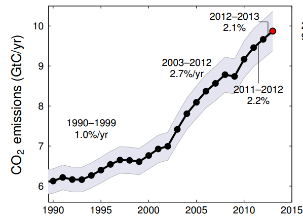
Global CO2 emissions from fossil fuel burning and cement production, gigatons carbon per year.

The plot above shows how much carbon is released each year from fossil fuel burning and cement production. So what does it tell us? Well, first of all the amount of carbon emissions is increasing every year. It’s important to note that even if carbon emissions stopped growing tomorrow, the amount of carbon in the atmosphere would continue increasing. This can be best understood by the bathtub analogy.

Not only is the amount of emissions increasing every year (with the exception of the global financial crisis), but for most of the time period the rate of increase was increasing. This is not good.

Finally, there’s a kink in the slope of the graph around 2002. What’s going on there?

countries co2 per year

CO2 emissions from fossil fuel burning and cement production in selected countries, gigatons carbon per year.

And here we have the answer. Starting in the early 2000s, China began a period of explosive economic growth and infrastructure development, and carbon emissions increased as a result. Much of the increase in Chinese carbon emissions is due to coal-fired power plants, but cement production and petroleum also played a part. Sometime around 2006 China surpassed the U.S. as the world’s largest carbon emitter (although on a per capita basis the U.S. still releases a much larger amount of greenhouse gases). From 2011-2012 Chinese carbon emissions grew almost 6%, while U.S. and European emissions actually decreased.

historic cumulative emissions

Cumulative Global CO2 emissions for selected countries and regions over time

One common argument you will hear at international climate change negotiations is that rich countries, like the U.S. and EU nations, are responsible for the majority of historic cumulative carbon emissions and should therefore bear a larger share of the responsibility of mitigation of and adaptation to climate change. And while the premise of this argument – that a small set of rich countries is responsible for most of the carbon that has been emitted into the atmosphere – is true,  it is changing. 

Take a look at the graph above. You can see that 140 years ago the majority of carbon from fossil fuel burning in the atmosphere was from Europe. That makes sense. The industrial revolution began there and Europe was still the most highly industrialized region on earth. By 1960, the U.S. was responsible for a bit more than 40% of the total historic anthropogenic carbon emitted to the atmosphere, and Europe about an equal amount. The rest of the world had contributed less than 20% of cumulative emissions. But today, the U.S. and Europe are responsible for 50% of cumulative emissions, and countries like China and India are rapidly increasing their cumulative total. So this argument may lose its appeal for some countries if current trends persist.