A Dataset of all American and British Bombing Missions in WWII

Sometimes you come across a dataset so interesting you just have to stop everything and visualize it. That’s what happened when I saw a tweet from @JulesGrandin  about the THOR database. THOR stands for Theater History of Operations Reports, and it’s a massive database published by the U.S. Defense Digital Service of all releasable U.S. air operations, including WWI, WWII, and the Korean and Vietnam wars. The data on WWII, which I downloaded, also includes Royal Air Force missions as well as some from the South Africa, Australian, and New Zealand Air Forces.

Here’s an animation (using CARTO) of all 178,263 WWII bombing missions from the database:

And here is a map of all the bombing missions colored by aircraft type. You can clearly see the prevalence of the B17 in the European theater, the B29 in Japan, and the P51 in China. Zoom in and click on the individual points to view other attributes of the bombing missions.

These maps barely scrape the surface of what is possible with this dataset. In addition to aircraft type there are many other attributes, including air force, unit, target type, bomb type, and tonnage of bombs dropped. This page from the Defense Digital Service provides some more interesting tidbits gleaned from the WWII data.

Advertisement

Deadly Swiss Avalanches, in Maps

In my previous post, I explored a dataset on fatal avalanches in Switzerland from the Swiss Institute for Snow and Avalanche Research (SLF). The dataset also contains the location of each avalanche, and here I’ll explore a few ways to show the data geographically.

In the map above, the location and date of each avalanche is used to make a time lapse with CartoDB’s Torque function. Each flashing white marker is one fatal avalanche. Besides the general location of avalanche risk in Switzerland and the seasonal pulsation of events, this map does not convey all that much information. However, I think it is worthwhile because it drives home the sheer number of deadly avalanches – 361 – during this period. We have to keep in mind that each of these flashing markers is a separate tragedy that together represent the loss of  465 lives.

This map shows the geographical distribution of fatal avalanches by the activity or location involved in the accident. As I discussed in the last post, the great majority occurred in open country during recreational activities like backcountry touring or off-piste skiing. The map illustrates that backcountry touring accidents are distributed fairly evening across the high Alps, while off-piste skiing and snowboarding accidents tend to be clustered. Closer inspection reveals that these clusters occur around high mountain lifts, like this, the largest cluster, one on the north slope of Mt. Gele and Mt. Fort near the resort of Verbier:

Screen Shot 2016-04-01 at 9.43.47 PM

This map also lends itself well to exploration. The Open Street Map base has great detail upon zooming, and you can click on each point to get more information about each avalanche, such as elevation, aspect, date, and number of fatalities.

Finally, here’s a heatmap showing the density of fatal avalanches, with red areas having the highest densities. The cantons of Valais (in the southwest) and Grisons (in the east) have the highest concentrations of deadly avalanche accidents. I used a Landsat mosaic as a base map, which allows for comparison of the relationship between terrain and avalanche density.

All avalanche data from WSL Institute for Snow and Avalanche Research SLF, 25 March 2016. Data and code available here. Maps generated using CartoDB.

Has Your Country Ratified the Minamata Convention on Mercury?

This map shows the current status of ratifications of the Minamata Convention on Mercury. Although I update it frequently, check mercuryconvention.org for the most recent status. The map also shows countries engaged in Minamata initial assessment (MIA) and artisanal and small-scale  gold mining national action plan (NAP) projects funded by the Global Environment Facility (GEF), along with the implementing agencies. Use the “Visible layers” function on the map to toggle between ratification status, MIAs, and NAPs. The full screen button, located below the zoom controls, is also useful.

Data on ratification and GEF project status from the Interim Secretariat of the Minamata Convention and UNEP. Country boundaries from Natural Earth. Mapping done in CartoDB using Robinson projection.

Showing Refugees Some Love

The terrorist attacks in Paris on November 13 brought renewed attention to the movement of refugees from Syria to the West. Unfortunately, much of this attention has been negative, despite the fact that refugees are fleeing the very brutality that was unleashed on Paris. The rhetoric from the Republican presidential candidates in the U.S. has been particularly vile. However, many people around the world continue to welcome refugees and show compassion. That’s why I made this visualization:

This map shows positive media coverage of refugees over the past 24 hours (updated hourly). Each animated marker represents one positive media mention about refugees in a particular location.

The data comes from GDELT (The Global Database of Events, Language, and Tone). GDELT’s Global Knowledge Graph monitors media in 65 languages around the world and uses algorithms to measure the emotions and tone of the texts. The map shows results on the theme of “refugees” with a tone of greater than two. Tone is the most basic GDELT parameter, and measures how positive or negative a media article is. So, for example, this article about how churches in Kansas and Nebraska are ready to help refugees is included in the dataset.

How I made the map

This map is a nice demonstration of some useful CartoDB features, such as sync tables, animation, and custom map projections.

I used the GDELT Global Knowledge Graph API to pull the data and load it into CartoDB. The exact API call is:

http://api.gdeltproject.org/api/v1/gkg_geojson?QUERY=REFUGEES&TIMESPAN=1440&OUTPUTFIELDS=url,name,tone&OUTPUTTYPE=2

This returns a geojson file with all the results over the last 24 hours tagged with the “refugees” theme. Using CartoDB’s sync tables you can set the data table to update automatically. Mine updates every hour.

I filtered the results to only include articles with a tone score of greater than two (positive coverage), and then used CartoDB’s Torque tool to create the animation with a custom marker (the heart).

The map projection is a modified Bonne, with the standard parallel set to 90 degrees North to make it appear more heart-shaped. Here is a useful tutorial for using different projections in CartoDB.

Inspiration came from this blog post, and this tutorial was very helpful in figuring out how to use the GDELT API. You can access the data from my CartoDB page here and easily create a map of your own.

I Say Tomato, You Say… Apple of Paradise?

Etymology of “tomato” in Europe and the Mediterranean

It’s been an extremely hot summer, which has led to a bumper crop of tomatoes. The harvest is so big that I’ve been bringing them to work to give to colleagues. I work in a very international office, and recently the discussion turned to how to say “tomato” in everyone’s native language. The results were interesting, and inspired this map (mouse over each country for more details):

The tomato plant is native to South America, but was first domesticated by the Aztecs in present-day Mexico. Their word for the fruit was tomatl*, which means something like “the swelling fruit”. The Spanish brought it to the New World in the 16th century, calling it a tomate.

Many languages still use a derivative of the Spanish word tomate, but another name arose in Italy. The Italian word for tomato is pomodoro, which came from pomo d’oro, or golden apple. Somehow** that name spread to Poland, where they say pomidor, and from there to Russian, Ukrainian, and several other languages.

A different name arose in some German dialects: Paradiesapfel, or “apple of paradise”, which for anyone who has eaten a ripe one right from the vine is an apt description. Although modern Germans way tomate, Austrians call it a paradieser, and variants of this were adapted into Czech, Slovak, Hungarian, Serbian and others.

In Arabic, it seems there are two common ways to say “tomato” (At least that’s what my friends tell me. I’d be happy for feedback from any Arabic linguists out there.) There’s tamatim (طماطم),  which is used in North Africa. That, of course, comes from tomate. But in the Near East (Syria, Jordan, Lebanon), the common term is banadora (بندورة), from the pomo d’oro family. 

It gets really interesting in Hebrew, which has a word for tomato unlike any other language. The word is agvania (עגבניה). It was coined only in 1886 and has as its root the Hebrew word for “to love, desire”. This name was chosen because of the archaic English term “love apple”, an homage to the apparent aphrodisiac properties of the tomato. More on the story of the Hebrew word here.

So there you have it. Pretty interesting for a fruit (vegetable?) only introduced to much of the world a few hundred years ago. Sources for map include Google Translate and Cultivated Vegetables of the World: A Multilingual Onomasticonan actual book that actually exists. I made the map in CartoDB using the Watercolor base map from Stamen Design. If you want to see more etymology maps, there’s a subreddit dedicated to the topic.

And if all that hasn’t made you hungry from some apples of paradise, this will:

tomatos

UPDATE: A few readers have correctly pointed out that what I have is a map of nation states, not a map of languages. For the sake of simplicity I am using national borders as a proxy for language regions. I should have specified that I selected the language for each country based on the official language, or if there is more than one, the most commonly spoken language. One negative consequence of that approach is that several states languages did not make it onto the map (e.g. Basque (tomate or tomatea) and Kurdish (temate)).

* More precisely, “tomatl” comes from the Nahuatl words “tomohuac” (swelling, roundness, fatness) and “atl” (water). 

** I have subsequently been informed that “pomodoro” was introduced to Poland by the Italian noblewoman Bona Sforza, who became Queen of Poland by marriage in 1518. 

Thanks to the members of reddit.com/r/etymologymaps for the helpful feedback and corrections

A Map of All the Mountains in Switzerland Accessible by Public Transport

In honor of Swiss National Day I made a map of all the mountains in Switzerland accessible by public transport (cable car, gondola, cog-wheel railroad, funicular, and chairlift). With the Swiss transportation system you can get to almost all the base stations by train or bus. Having such great access to high places is one of my favorite things about Switzerland.

I made the map in CartoDB using data from a great Wikipedia page. There are about 100 peaks on the list, all with an elevation of at least 800 m, a topographic prominence of at least 30 meters, and a transport station within 120 m of the summit. The highest is the Klein Matterhorn, where you can take a cable car to within 20 m of the 3,883 m summit. The current weather at the time of writing? You guessed it – snow. Here’s the webcam.

For the base map, I used Open Street Maps Switzerland (easily done in CartoDB using XYZ map tiles). While it’s a little more cluttered than I’d like for a base map, the level of detail in the mountain areas is great. You can really zoom in to plan your trip.

Screen Shot 2015-08-01 at 4.42.57 PM

One more feature I played with in CartoDB is the customizable infowindows. I added a photo and a link to the Wikipedia page of each peak so it’s more enjoyable to to explore the map and use it as a tool for planning your summit assaults.

Visualizing 100 Years of Earthquakes

My last post was about the 1960 Chile megathrust earthquake, and how much energy it released (about 1/3 of all seismic energy on earth over the last 100 years). I used data from USGS on all earthquakes greater than magnitude 6 from 1915-2015. Since I had this nice dataset (about 10,500 quakes), I could not resist playing around in CartoDB to make some nice visualizations.

This is an animated map of all earthquakes since 1915 using the Torque function in CartoDB. I know this has been done many times, but it makes such a striking image it’s hard to resist. If you watch closely you’ll notice that the earthquakes seem to occur more frequently towards the end of the time lapse (starting in the 1960s). That’s because seismologists got better at measuring and recording earthquakes, not because the quakes actually became more frequent.

This is a heatmap of all quakes in the dataset. The Pacific ring of fire (the arcs of subduction zones encircling much of the Pacific Ocean) dominates the global pattern. The mid-ocean spreading centers are also visible, but not as pronounced the ring of fire. There are fewer big earthquakes in the extensional spreading centers than the compressional subduction zones. There is also a broad zone of earthquake activity that stretches from Italy and Greece through Asia Minor, Iran, Central Asia, the Himalayas, into China. This is a huge zone of compression caused by the African, Indian, and other small plates colliding with Eurasia.

This map shows earthquake depth, with deep earthquakes in red, intermediate depth in orange, and shallow in yellow. Plotting earthquake depth on a map illustrates the geometry of subduction zones. For example, in South America, the ocean crust of the Nazca plate (under the Pacific Ocean) is subducting under the South American plate. As the Nazca plate plunges eastward at an angle, the earthquakes produced get deeper with distance to the east.

You can pan and zoom right in the embedded maps if you are keen to explore. You can also make the maps full screen using the button on the upper left.

10 Maps that Explain Switzerland

Ah, Switzerland. Land of fondue, chocolate, and neutrality. If you want to learn more about this unique little country, maps are a great way to start. Not only does Switzerland have fascinating geography, but it also has a long and storied tradition of cartography and design.

1. Where in the world?

But you already knew that, right? And you also knew that the capital is Bern, not Zurich or Geneva. Switzerland is not very big. It’s the world’s 135th largest country. Four U.S. counties are larger. But what it lacks in size it makes up in other ways. For example, The Economist ranked it the best country in the world to be born in.

2. Confoederatio Helvetica

cantons-page-001
Switzerland is made up of 26 cantons, many of which were established as sovereign states hundreds of years ago. Then, in 1848, with the establishment of the Swiss Constitution, the cantons joined together to form the Swiss Confederation, or in Latin,  Confoederatio Helvetica. That’s where the abbreviation “CH” comes from.

Switzerland is a federal states and the cantons still retain strong identities and policy autonomy, in a way that’s analogous to the states in the U.S.

3. A multilingual nation

Switzerland has four official languages: German (the most prevalent), French, Italian, and Romansh. Romansh is spoken by less than 1% of the population, and only in a few places in Eastern Switzerland. I personally have never heard an utterance of Romansh. But it’s the only language unique to Switzerland, so I suppose it has a special place in the Swiss national identity.

The Swiss have a well-deserved reputation as polyglots. Almost all Swiss people I know speak at least two Swiss languages plus English, and some many more.

4. Let’s get physical

land use-page-001

This map shows the terrain of Switzerland together with land use. You can immediately see that Switzerland is a mountainous country, with the Alps  dominating the southern 2/3 and the smaller Jura Mountains along the northwest border. The bit in the middle, which is also where most of the people live, and most of the agricultural land and industrial production are located, is called the Swiss Plateau.

You’ll also notice the lakes. Switzerland has a lot of them, including some of the biggest lakes in Europe. Most Swiss lakes, including Geneva, were formed when the ice sheets of the last glacial period retreated, leaving deep basins carved by ice, and filling with water from the melting glaciers. More on the ice age below.

5. A geologist’s paradise

Ok, this one’s not a map. It’s a geologic cross section (source) showing a very simplified version of what the earth might look like if you cut out a slice 50 km deep and several hundred km long from Italy in the south, through the heart of the Swiss Alps, and north into France. The diagram gives an idea of the folding and faulting wrought by the massive tectonic collision that created the Alps.

In simplest terms, the Alps formed when two tectonic plates, the African and Eurasian plates, collided over millions of years. It all started in the Late Cretaceous, around 100 million years ago, when the ocean that separated what are now Eurasia and Africa began to close. Eventually the two continental masses themselves collided, with rocks on African side thrust up and over the Eurasian plate. The suture where the two plates became fused is called the Insubric Line.

The Alps are tectonically active to this day, raising up on the order of 1 mm per year. To geologists, the Alps are special because they were the first collisional mountain range to be studied extensively and much of the early understanding of structural geology comes from those pioneering Alpine studies.

6. The ice age

LGM

Made with the Swiss Federal Geoportal mapping tool

If the great tectonic collision provided the medium of folded, faulted and uplifting rock, the ice ages were the sculptor who fashioned the Swiss Alpine landscape into the wonder that we recognize today. The map above shows the extent of the ice cap that covered much of present-day Switzerland during the last glacial maximum, about 20,000 years ago.

The glaciers carved the spectacular U-shaped valleys and jagged peaks of the Alps. They also created the basins that would eventually be filled with water and form the Swiss lakes. Other evidence of the the glaciers is often visible in Switzerland, such as great boulders carried by the ice and stranded, and gentle hilly moraines that dot the Swiss Plateau.

7. The trains run on time

Back to the present day. One of the best things about Switzerland is the passenger train network, depicted on the map above, which you’ll find in every train car and station in the country. It’s the densest passenger network in Europe. You really can get just about anywhere on the train, even high into mountain villages on the many cog wheel and narrow gauge lines. And the trains are on time. Well, 95% of them, according to the Swiss national railway company. To really appreciate the attention to detail that the Swiss give to rail travel, check out this incredible diagram.

8. Let’s hit the slopes

When you think of Switzerland, you think of skiing, and the Swiss Alps have some of the top ski resorts in the world. One thing I love about the alpine ski resorts, aside from the great slopes, are the beautiful hand drawn piste maps. Here’s one of the Grindlewald/Wengen area in the Bernese Oberland. Just looking at it makes me want to start planning next year’s ski trip.

9. Direct democracy

Anti-Einwanderungsinitiative 2014.svg

“Anti-Einwanderungsinitiative 2014” by Furfur, based on the file Kantone der Schweiz.svg, made by KarzA. – Own work, data source: Neue Zürcher Zeitung: SVP-Abstimmungskrimi vorbei: Die Überraschung ist perfekt. Licensed under CC BY-SA 3.0 via Wikimedia Commons.

Switzerland is famous for its direct democracy, the process whereby voters frequently weigh in on referendums, popular initiatives, and even have veto power over laws.  The Swiss vote a lot. Elections happen about four times a year and often contain several referendums at the national, cantonal, and local level, as well as ballots for elected representatives.

The map above shows the results of a popular initiative in 2014 that sought to restrict immigration by EU nationals into Switzerland. It passed narrowly, with strong support from the Italian- and German-speaking regions and despite opposition in the French-speaking regions.

Immigration is a contentious issue in Switzerland (as in many other parts of the world). Relative to its population, immigration levels are quite high, compared to say, Germany or even the U.S. In some cases, xenophobia wins out in popular initiatives, such as when the Swiss voted in 2009 to prohibit the construction of minarets.

10. A rich cartographic history
Dufour
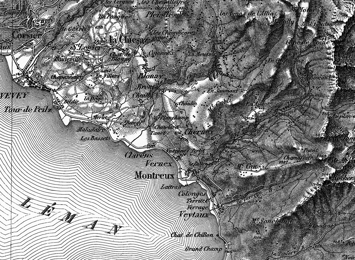
With its varied geography and strong scientific and educational traditions, it’s no surprise that Switzerland has produced some stunning cartography. The first official map series to encompass all of Switzerland was produced by Guillaume-Henri Dufour and published from 1845-1865. The result of decades of surveying, drawing, copperplate engraving, and printing, the map achieved a high level of accuracy and detail for its time, and is also distinguished by the attractive use shading to show topography. More information on the Dufour map, as well as the equally impressive Siegfried map is available here.

Swiss excellence in mapping continues to this day. For example, the Federal Geoportal has a great mapping tool that allows you to access and display hundreds of data layers, from road networks to wetlands.

Two Ways to Map Global Mercury Emissions

I’ve been playing with an interesting dataset recently, and it got me thinking about challenges in effectively visualizing geospatial data. Specifically, how do you best display a continuous variable whose values span several orders of magnitude?

The dataset I’m working with comes from the Arctic Monitoring and Assessment Program. It’s a estimate of global anthropogenic emissions of mercury per 0.5 x 0.5 degree grid square. One important reason why AMAP generated these data (and how they did it is an interesting problem and the topic for another post) was to help atmospheric transport modelers who need to know where on earth emissions are coming from. But the data also allow for a nice visualization of global sources of mercury pollution that goes beyond simple maps showing emissions by country.

I’ll present two options here, and I’d love feedback on what works best. I think there are also trade-off depending on what the purpose of the visualization is (presentation vs. exploration) and the scale. Both are made on CartoDB. You can zoom, scroll, and click on a point to see the data. Check out the full-screen option which I think is pretty cool.

The first is perhaps the more flashy one. It uses yellow circles whose size are proportional to mercury emissions. There is a multiply effect so areas of overlap appear orange-red.

This one is a more traditional chloropleth approach using an orange-red scale to represent the magnitude of emissions over each grid square.

Some technical notes:

The dataset contains around 45,000 grid squares (areas with no anthropogenic emissions, like oceans, are no data) with mercury emissions ranging from about 10^-5 to 12,000 kg. That’s around 8 orders of magnitude. Some quick exploration of the data revealed that almost all the mercury emissions came from less than 10 percent of the model area.

global hg dist

Cumulative sum of mercury emissions (normalized to 1) as a function of magnitude of emissions in each cell. Almost all emissions are from cells with greater than 10 kg emissions. Note log scale on x axis.

Most areas have very small emissions, but a few have very high emissions. The data are like this because the emissions estimates are made using both point sources, “area” sources like artisanal mining, and population as a proxy for some general emissions. In any case, to facilitate visualization I  removed the very-low-emissions-value grid squares. The remaining ~5000 squares comprise ~93% of total emissions. These data still have a pareto-like distribution ranging almost three orders of magnitude, but they are easier much easier to display on a map.

global hg dist tail

Cumulative sum of mercury emissions (normalized to 1) as a function of magnitude of emissions in each cell. Cells with < 50 kg Hg removed. Note log scale on x axis.

Note that the maps display mercury emissions per square km for each cell, not total mercury emissions. That is because the areas of the 0.5 x 0.5 grid cells vary with longitude. Those closest to the equator are larger, closer to the poles are smaller. So it makes for a more accurate display to normalize by the cell area.

An important factor in the visual appearance of continuous data like these is where to choose the breaks separating data points into different colors or sizes. This is especially difficult with pareto or power law distributions. CartoDB has several built in options for binning data. After playing around with them I choose head/tail breaks, which seems to work well on this type of distribution. CartoDB also allows you to easily change the breaks manually with cartoCSS. It was a challenge to find a binning and color/size scheme that portrayed the data in the most accurate way, while also maintaining a clear and striking appearance.

Color on the chloropleth comes from colorbrewer.

For more information on the development on the emissions model, see this paper.

Mercury in Chlor-Alkali Plants Mapped with CartoDB

The other day I learned that wordpress.com now supports embeds of CartoDB maps. This is pretty cool, and it inspired me to finish up a little project that I’ve been tinkering with for a while, in order to try out the new feature.

By the way, CartoDB is a web mapping tool that I think is one of the best interfaces available for creating interactive maps. You can make great looking maps quickly and easily, but there is also enough functionality to do more advanced stuff, like mess around with the CSS code.

This map shows estimates of how much mercury is on site at chlor-alkali plants per country. It distinguishes between countries that ban the export of mercury and those that don’t. This is important because chlor-alkali plants often contain hundreds of tons of mercury. When the facilities close the mercury can enter the commodity market where it can be used in artisanal gold mining.

The size of the bubbles reflects how many tons of mercury are estimated to be in chlor-alkali facilities in each country. Scroll, zoom, hover, or click for more details. The data are from the UNEP Global Mercury Partnership chlor-alkali inventory.

Technical CartoDB note: In order to distinguish (by bubble color) countries with and without export bans, I made two layers from the data table. However, because each set had a different range of values, the scale for the bubble size was different for each color. To fix this I manually changed the bubble size distribution cutoffs in the CSS tab. Is there an easier solution that I am missing?

Oh yeah, this is how you do the embed.