It’s no secret that interest in data visualization has been growing in recent years. Don’t believe me? Let me show you a graph:

From Google Trends
Sure, humans have been presenting information graphically for hundreds, if not thousands, of years, with increasing sophistication. We still study the work of people like John Snow, William Playfair and Florence Nightingale for their innovations in graphical presentation. Today, however, with the increasing availability of large, rich, and easily accessible datasets, and the proliferation of software tools for creating graphics, we are seeing an explosion in the amount of data visualizations. This is a great development. I obviously think so, since I jumped on the bandwagon.
The recent ubiquity of the data visualization brings with it a new subgenre, the meta-visualization. Visualizations about visualizations. Some of these describe what data visualization is, or should be. Some present information about common types or characteristics of visualizations. Still others poke fun at cliches, poor practices, and the very pervasiveness of visualization as a medium for communicating information. Let’s take a look at some examples.
First, here’s the Infographic of Infographics:

Then there’s this periodic table of types of visualizations:

Robert Kosara is not amused. For an nice take on the actual periodic table (the one with the elements), have a look at this.
Continuing with the periodic table theme, here is a periodic table of period tables. This is very meta.

But does this periodic table of periodic tables contain itself? (It does.) And, more importantly, should a periodic table of all periodic tables that do not contain themselves contain itself.
Some graphics attempt to illustrate what characteristics a good data visualization should have. Like this 4-set Venn diagram, for example:

Or like this Venn-like diagram, which I’m not quite sure how to read:

Now if you really want to turn it up to 11, or more accurately, up to seven, you could employ this epic 7-set Venn diagram:

Click on this. You won’t regret it.
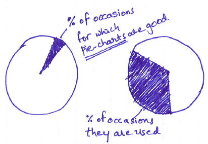
Another category of meta-visualizations contains humorous or satirical ones. These are not literally visualizations of other visualizations, but they are about visualization as a medium. These are funny, self-aware takes on the cliches and excesses in the field. Pie charts that skewer the graphical form of the pie chart itself are practically a sub-subgenre in themselves:
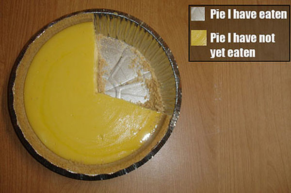
Really, nobody seems to have any love for the pie chart.
Or, you know how there are like a million maps on the internet showing which state or country is the most this, or the most like that? Well that’s the set up for this brilliant satirical tweet:
And on the topic of maps, here’s a gem from xkcd:

Its fully because it’s true!
Finally, we venture into silliness with one of my all-time favorites, All You Need to Know about Lady Gaga’s Hit “Bad Romance” in One Chart:

To sum up, here is a word cloud visualization of this post:

