In the previous post, I used Tableau Public to create a visualization of the Seafood Hg Database. That graphic showed the mean mercury content and number of samples by seafood category. But there are several other dimensions in the database, including the year of the study and the particular species of seafood sampled. I couldn’t resist playing around with the data a little more, this time using the lattice package in R.
The plot below shows the mean mercury concentration (y-axis) in studies of the 12 seafood categories with the highest median mercury concentration. The x axis shows the date of the study. I’ve also plotted a trend line for each panel. This is a nice way to visualize the data, but I wouldn’t read too much into this plot. For one thing, many of the seafood categories contain multiple species, some of which are higher than others in mercury. Also, this plot does not account for the geographical region where the fish were sampled.

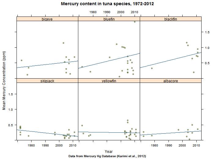
We can tease a little more from the dataset by looking at the individual species within a seafood category. Here is a plot of the six tuna species with the greatest number of studies. The larger species, like bluefin, seem have higher mercury contents than the smaller ones, like skipjack. One curious feature of the dataset is also visible here: there were very few studies of mercury in seafood in the 1980s.

Guess it is good that we don’t eat much prey fish!