There are almost always several ways to graphically present a given dataset. The best one depends on the message you’re trying to convey. Recently, our team was trying to show progress among national governments towards passing laws that ban the use of lead in paint. (Lead is highly toxic, and lead in paint is a particularly pernicious exposure route for children.) After almost two years of work, only a few of the countries we are working with had adopted final laws, but nearly all had started to take action and were on the way to legislating. The initial idea for showing the data was two pie charts.

But we felt we could improve on this. They main message – that the number of countries not taking action fell dramatically – was not coming through strongly enough. So we decided to try using a slope chart.
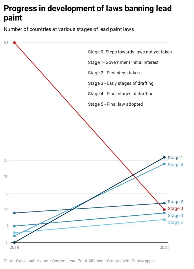
With the slope chart, the steep drop in the number of countries not yet taking action (from 61 to 10) really stands out for the user, because of negative slope and color. The number of countries progressing to higher stages increases from 2019 to 2021, as seen by the positive slope of the blue line.
This design also gave me the opportunity to try out datawrapper, which I had never used. First impression: a very intuitive and customizable charting tool! There’a a tutorial specifically for creating slope charts.
This is certainly not the only way to display the data. I think it works, but perhaps there are better solutions. For example two horizontal bars would be a simple and economical solution that would also preserve the part-to-whole relationship. Please feel free to share your ideas!

This is really interesting to me, as a lot of my job is deciphering key messages and communicating to our graphics team what the best way to visually represent that message is. Does Datawrapper allow for animations? That could open up possibilities for other kinds of graphics to show changes over time rather than being limited to messaging on a static image.
I don’t think Datawrapper does animations, but Flourish has an animated bar chart race template which is pretty cool: https://app.flourish.studio/@flourish/bar-chart-race.
How about a Sankey diagram?
That’s a good idea!