When I was a kid I would ask my Mom what she wanted for Christmas, and she would usually say, “Don’t buy me anything. I’d prefer if you just make me something instead.” I’d always think this was strange. Why would she prefer a silly drawing or collage when she could have something nice, shiny, and new from the store?
Now of course I understand the appeal of a handmade creation. There’s something very personal and unique about it. The same appeal can apply to handmade data visualizations too. Here’s one I made to show who brought the most coffee to the office coffee club:
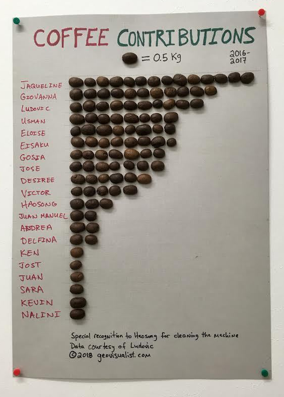
Now you might think this is silly – which it is – but it really got people’s attention, and now coffee contributions are way up in 2018. So by that metric it’s an effective visualization!
To see some very attractive and very professional handmade data visualizations, check out Adriano Attus’ work for Moda 24

Excellent post. And I hope you are also inspired to increase your coffee contribution!