3

Showing Refugees Some Love

The terrorist attacks in Paris on November 13 brought renewed attention to the movement of refugees from Syria to the West. Unfortunately, much of this attention has been negative, despite the fact that refugees are fleeing the very brutality that was unleashed on Paris. The rhetoric from the Republican presidential candidates in the U.S. has been particularly vile. However, many people around the world continue to welcome refugees and show compassion. That’s why I made this visualization:

This map shows positive media coverage of refugees over the past 24 hours (updated hourly). Each animated marker represents one positive media mention about refugees in a particular location.

The data comes from GDELT (The Global Database of Events, Language, and Tone). GDELT’s Global Knowledge Graph monitors media in 65 languages around the world and uses algorithms to measure the emotions and tone of the texts. The map shows results on the theme of “refugees” with a tone of greater than two. Tone is the most basic GDELT parameter, and measures how positive or negative a media article is. So, for example, this article about how churches in Kansas and Nebraska are ready to help refugees is included in the dataset.

How I made the map

This map is a nice demonstration of some useful CartoDB features, such as sync tables, animation, and custom map projections.

I used the GDELT Global Knowledge Graph API to pull the data and load it into CartoDB. The exact API call is:

http://api.gdeltproject.org/api/v1/gkg_geojson?QUERY=REFUGEES&TIMESPAN=1440&OUTPUTFIELDS=url,name,tone&OUTPUTTYPE=2

This returns a geojson file with all the results over the last 24 hours tagged with the “refugees” theme. Using CartoDB’s sync tables you can set the data table to update automatically. Mine updates every hour.

I filtered the results to only include articles with a tone score of greater than two (positive coverage), and then used CartoDB’s Torque tool to create the animation with a custom marker (the heart).

The map projection is a modified Bonne, with the standard parallel set to 90 degrees North to make it appear more heart-shaped. Here is a useful tutorial for using different projections in CartoDB.

Inspiration came from this blog post, and this tutorial was very helpful in figuring out how to use the GDELT API. You can access the data from my CartoDB page here and easily create a map of your own.

Advertisement
8

Illustrating the Arc of European Colonialism Using a Dot Plot

A while back I was thinking about European colonialism and the enormous impact it’s had on world history. Wouldn’t it be nice to have a simple visualization to illustrate colonization and decolonization around the world? It occurred to me that a dumbbell dot plot would work well for this task. Here’s what I came up with:

colonial2

The chart shows the dates of colonization and independence of 100 current nations. The countries are organized into broad regions (Asia, Africa, and the Americas), and sorted by date of independence. Color represents the principal colonial power, generally the occupier for the greatest amount of time.

There are many interesting patterns visible in the chart. For example, you can clearly see Spain’s rapid conquest of Central and South America, and then even more rapid loss of its colonies in the 1820s. The scramble for Africa in the late 19th century stands out well, as does the rapid decolonization phase of the late 1950s through early 1970s.

About the Data

To reduce complexity to a manageable level, I set some limitations on what countries to include. First, the chart shows only those countries victim to Western European colonialism. I don’t include Ottoman, Japanese, Russian, American, or other colonial empires. I also don’t include territories that are still governed by former colonial powers (e.g. Gibraltar). This gets controversial and complicated. Countries that were uninhabited upon discovery by colonial powers are also not included. The same with countries that later gained independence from a post-colonial state (e.g. South Sudan).

The dates of independence come from the CIA World Factbook (here). Dates of colonization were derived by my own research, mostly from Wikipedia country pages. I quickly found that establishing a date of colonization is a somewhat subjective decision. Do you choose the date of first European contact? Formal incorporation of the territory into the colonial empire? For the most part, I chose the date of the first permanent European settlement. Notes on the rationale for the date chosen are include in the data spreadsheet (below). In looking at the chart, it’s important to remember that in many cases colonial subjugation was a long process, moving from initial contact, to trade, conquest, settlement, and incorporation.

Constructing the Plot

I wanted to make this plot using ggplot2 in R, but was not sure about best approach. So I reached out on Twitter to dataviz guru and dot plot enthusiast @evergreendata

The response from the #rstats and dataviz community was extremely constructive and useful. Users  @hrbrmstr@jalapic@ramnath_vaidya, and @plotlygraphs all provided great examples (here, here, here, and here, respectively). In the end, I chose to adapt the approach taken by @jalapic.

A quick note on color: I choose colors from the flags of the principal colonial powers to represent them on the plot (except for the Netherlands for which I picked orange). The idea is to make it easier for the viewer to match the color with the country without having to always go back to the legend. I’d be interested in any reactions to this approach. In general, I’d be thrilled with any feedback on how to make this plot better.

Data and code for the plot:


Country Colonized Independence Region Principal Colonial Power Remarks on independence Remarks on date of colonization
Algeria 1830 1962 Africa France 5 July 1962 (from France) Conquest of Algiers
Angola 1575 1975 Africa Portugal 11 November 1975 (from Portugal)
Antigua and Barbuda 1632 1981 Americas UK 1 November 1981 (from the UK)
Argentina 1542 1816 Americas Spain 9 July 1816 (from Spain) Viceroyalty of Peru
Australia 1788 1901 Asia UK 1 January 1901 (from the federation of UK colonies) Australia Day
Bahrain 1892 1971 Asia UK 15 August 1971 (from the UK)
Barbados 1627 1966 Americas UK 30 November 1966 (from the UK)
Belize 1638 1981 Americas UK 21 September 1981 (from the UK)
Benin 1892 1960 Africa France 1 August 1960 (from France)
Bolivia 1533 1825 Americas Spain 6 August 1825 (from Spain) Conquest of Inca Empire
Botswana 1885 1966 Africa UK 30 September 1966 (from the UK)
Brazil 1534 1822 Americas Portugal 7 September 1822 (from Portugal) Captaincies of Brazil
Brunei 1888 1984 Asia UK 1 January 1984 (from the UK) Treaty of Protection
Burkina Faso 1896 1960 Africa France 5 August 1960 (from France) Become French Protectorate
Burma 1885 1948 Asia UK 4 January 1948 (from the UK) Annexed after Third Anglo-British War
Burundi 1891 1962 Africa Belgium 1 July 1962 (from UN trusteeship under Belgian administration) Originally part of German East Africa
Cambodia 1867 1953 Asia France 9 November 1953 (from France) Originally claimed by Germany
Cameroon 1884 1960 Africa France 1 January 1960 (from French-administered UN trusteeship)
Canada 1534 1867 Americas UK 1 July 1867 (union of British North American colonies); 11 December 1931 (recognized by UK per Statute of Westminster) New France
CAR 1894 1960 Africa France 13 August 1960 (from France) Ubangi-Shari
Chad 1900 1960 Africa France 11 August 1960 (from France) Territoire Militaire des Pays et Protectorats du Tchad�
Chile 1541 1810 Americas Spain 18 September 1810 (from Spain) Santiago founded
Colombia 1510 1810 Americas Spain 20 July 1810 (from Spain) Founding of Santa Mar�a la Antigua del Dari_n
Comoros 1841 1975 Africa France 6 July 1975 (from France)
DRC 1876 1960 Africa Belgium 30 June 1960 (from Belgium) Stanley's first exploration of the Congo
Congo, Republic of the 1880 1960 Africa France 15 August 1960 (from France) Treaty with de Brazza
Costa Rica 1522 1821 Americas Spain 15 September 1821 (from Spain) Arrival of Gil Gonzolez Davila
Cote d'Ivoire 1844 1960 Africa France 7 August 1960 (from France) Establishment of French Protectorate
Cuba 1511 1902 Americas Spain 20 May 1902 (from Spain 10 December 1898; administered by the US from 1898 to 1902); not acknowledged by the Cuban Government as a day of independence First Spanish Settlement
Djibouti 1894 1977 Africa France 27 June 1977 (from France) French Somalialand
Ecuador 1534 1822 Americas Spain 24 May 1822 (from Spain) Conquest of Sebasti�n de Benalc�zar
Egypt 1882 1956 Africa UK 28 February 1922 (from UK protectorate status; the revolution that began on 23 July 1952 led to a republic being declared on 18 June 1953 and all British troops withdrawn on 18 June 1956); note – it was ca. 3200 B.C. that the Two Lands of Upper (southern) and Lower (northern) Egypt were first united politically British occupation
El Salvador 1524 1821 Americas Spain 15 September 1821 (from Spain) Conquest by Pedro de Alvarado
Equatorial Guinea 1844 1968 Africa Spain 12 October 1968 (from Spain) Territorios Espa_oles del Golfo de Guinea
Fiji 1874 1970 Asia UK 10 October 1970 (from the UK) British subjugation
Gabon 1885 1960 Africa France 17 August 1960 (from France) Occupied by France
Gambia, The 1815 1965 Africa UK 18 February 1965 (from the UK) British presence established
Ghana 1612 1957 Africa UK 6 March 1957 (from the UK) Gold coast forts
Grenada 1649 1974 Americas UK 7 February 1974 (from the UK) French found permanent settlement
Guatemala 1524 1821 Americas Spain 15 September 1821 (from Spain) Conquest by Pedro de Alvarado
Guinea-Bissau 1482 1974 Africa Portugal 24 September 1973 (declared); 10 September 1974 (from Portugal) Portuguese gold coast colony
Guinea 1850 1958 Africa France 2 October 1958 (from France) French military penetration in the mid-19th century
Guyana 1616 1966 Americas UK 26 May 1966 (from the UK) Essequebo colony (Durch)
Haiti 1492 1804 Americas France 1 January 1804 (from France) Columbus found La Navidad
Honduras 1524 1821 Americas Spain 15 September 1821 (from Spain) Conquest of Gil Gonz�lez de �vila
Hong Kong 1842 1997 Asia UK none (special administrative region of China) Treaty of Nanking
India 1756 1947 Asia UK 15 August 1947 (from the UK) Company rule by East India Company begins
Indonesia 1602 1949 Asia Netherlands 17 August 1945 (declared) Dutch East India Company Established in 1602
Iraq 1920 1932 Asia UK 3 October 1932 (from League of Nations mandate under British administration); note – on 28 June 2004 the Coalition Provisional Authority transferred sovereignty to the Iraqi Interim Government League of Nations mandate under British administration
Jamaica 1509 1962 Americas UK 6 August 1962 (from the UK) First Spanish settlement
Jordan 1922 1946 Asia UK 25 May 1946 (from League of Nations mandate under British administration) League of Nations mandate under British administration
Kenya 1888 1963 Africa UK 12 December 1963 (from the UK) Imperial British East Africa Company
Kuwait 1899 1961 Asia UK 19 June 1961 (from the UK) British protectorate
Laos 1893 1949 Asia France 19 July 1949 (from France) French protectorate of Laos
Lebanon 1920 1943 Asia France 22 November 1943 (from League of Nations mandate under French administration) League of Nations mandate under French administration
Lesotho 1838 1966 Africa UK 4 October 1966 (from the UK) arrival of Trekboers
Libya 1912 1951 Africa UK 24 December 1951 (from UN trusteeship) Italian North Africa
Macau 1557 1999 Asia Portugal none (special administrative region of China) Portugal settlement
Madagascar 1882 1960 Africa France 26 June 1960 (from France) Malagasy Protectorate
Malawi 1876 1964 Africa UK 6 July 1964 (from the UK) Trading settlement at Blantyre
Malaysia 1511 1957 Asia UK 31 August 1957 (from the UK) Portuguese Malacca
Mali 1880 1960 Africa France 22 September 1960 (from France) French Sudan
Mauritania 1890 1960 Africa France 28 November 1960 (from France) Approximate
Mexico 1519 1821 Americas Spain 16 September 1810 (declared); 27 September 1821 (recognized by Spain) Spanish conquest
Morocco 1884 1956 Africa France 2 March 1956 (from France) First Spanish protectorate
Mozambique 1501 1975 Africa Portugal 25 June 1975 (from Portugal) Captaincy of Sofala
New Zealand 1788 1907 Asia UK 26 September 1907 (from the UK) Colony of New South Wales
Nicaragua 1524 1821 Americas Spain 15 September 1821 (from Spain) First Spanish settlements
Nigeria 1800 1960 Africa UK 1 October 1960 (from the UK)
Niger 1899 1960 Africa France 3 August 1960 (from France) Vouley Chanoine Mission
Oman 1507 1650 Asia Portugal 1650 (expulsion of the Portuguese) Occupation of Muscat
Pakistan 1765 1947 Asia UK 14 August 1947 (from British India) Start of company rule in Indian subcontinent
Papua New Guinea 1884 1975 Asia UK 16 September 1975 (from the Australian-administered UN trusteeship) German New Guinea
Paraguay 1537 1811 Americas Spain 14 May 1811 (from Spain) Founding of Asuncion
Peru 1532 1821 Americas Spain 28 July 1821 (from Spain) Battle of Cajamarca
Philippines 1565 1946 Asia Spain 4 July 1946 (from the US) Miguel Lopez de Legazpi arrives
Qatar 1916 1971 Asia UK 3 September 1971 (from the UK) British protectorate
Rwanda 1884 1962 Africa Belgium 1 July 1962 (from Belgium-administered UN trusteeship) Assigned to German East Africa
Senegal 1677 1960 Africa France 4 April 1960 (from France); note – complete independence achieved upon dissolution of federation with Mali on 20 August 1960 French control
Sierra Leone 1787 1961 Africa UK 27 April 1961 (from the UK) "Province of Freedom"
Solomon Islands 1893 1978 Asia UK 7 July 1978 (from the UK) British protectorate
Somalia 1920 1960 Africa UK 1 July 1960 (from a merger of British Somaliland that became independent from the UK on 26 June 1960 and Italian Somaliland that became independent from the Italian-administered UN trusteeship on 1 July 1960 to form the Somali Republic) Dervish state falls
South Africa 1652 1931 Africa UK 31 May 1910 (Union of South Africa formed from four British colonies: Cape Colony, Natal, Transvaal, and Orange Free State); 31 May 1961 (republic declared); 27 April 1994 (majority rule) Cape Town founded
Sri Lanka 1517 1948 Asia UK 4 February 1948 (from the UK) Portuguese establish Colombo
Sudan 1882 1956 Africa UK 1 January 1956 (from Egypt and the UK) British Occupation
Suriname 1667 1975 Americas Netherlands 25 November 1975 (from the Netherlands) Capture by Dutch
Swaziland 1890 1968 Africa UK 6 September 1968 (from the UK) British, Dutch, Swazi trimviral administration
Syria 1923 1946 Asia France 17 April 1946 (from League of Nations mandate under French administration) League of Nations mandate under French administration
Tanzania 1885 1964 Africa UK 26 April 1964; Tanganyika became independent on 9 December 1961 (from UK-administered UN trusteeship); Zanzibar became independent on 10 December 1963 (from UK); Tanganyika united with Zanzibar on 26 April 1964 to form the United Republic of Tanganyika and Zanzibar; renamed United Republic of Tanzania on 29 October 1964 German East Africa (Zanibar controled by Portuguese in 16th century
Togo 1884 1960 Africa France 27 April 1960 (from French-administered UN trusteeship) German Protectorate
Trinidad and Tobago 1530 1962 Americas UK 31 August 1962 (from the UK) Spanish settlement
Tunisia 1881 1956 Africa France 20 March 1956 (from France) French Invasion
Uganda 1894 1962 Africa UK 9 October 1962 (from the UK) Uganda Protectorate
United Arab Emirates 1820 1971 Asia UK 2 December 1971 (from the UK) Trucial States
United States 1607 1783 Americas UK 4 July 1776 (declared); 3 September 1783 (recognized by Great Britain) Jamestown
Venezuela 1522 1811 Americas Spain 5 July 1811 (from Spain) Settlement of Cumana
Vietnam 1862 1945 Asia France 2 September 1945 (from France) Cochinchina
Yemen 1839 1967 Asia UK 22 May 1990 (Republic of Yemen was established with the merger of the Yemen Arab Republic [Yemen (Sanaa) or North Yemen] and the Marxist-dominated People's Democratic Republic of Yemen [Yemen (Aden) or South Yemen]); note – previously North Yemen became independent in November 1918 (from the Ottoman Empire) and became a republic with the overthrow of the theocratic Imamate in 1962; South Yemen became independent on 30 November 1967 (from the UK) British occupy Aden
Zambia 1798 1964 Africa UK 24 October 1964 (from the UK) Claimed by Portugal
Zimbabwe 1888 1980 Africa UK 18 April 1980 (from the UK) British South Africa Company

view raw

colonial.csv

hosted with ❤ by GitHub


# Dumbell Dot Chart of European Colonialism
library(ggplot2)
library(tidyr)
library(dplyr)
library(scales)
colonial <- read.csv("colonial.csv", stringsAsFactors=FALSE,
col.names = c("country", "colony", "independence", "region", "pcp",
"remarks_ind", "remarks_col"))
df1 <- colonial %>% gather(status,year,2:3)
ind <- df1 %>% filter(status=="independence") %>% arrange(desc(year)) %>% .$country
df1$country <- factor(df1$country, levels=rev(ind))
colonial$country <- factor(colonial$country, levels=rev(ind))
#data frames used for labeling only one of the plot facets
f_labels1 <- data.frame(region = c("Africa", "Americas", "Asia"), label = c("Colonization", "", ""))
f_labels2 <- data.frame(region = c("Africa", "Americas", "Asia"), label = c("Independence", "", ""))
plot <- ggplot() +
geom_segment(data=colonial, aes(x=colony, xend=independence, y=country, yend=country), color="gray77",lwd=1)+
geom_point(data=df1, aes(year, country, group=pcp,color=pcp), size=3) +
scale_color_manual(values=c("#000000", "#318CE7", "#FF6600", "#006600", "#F1BF00", "#CF142B"))+
ggtitle("Five Centuries of Colonialism") +
xlab("") + ylab("") +
facet_grid(region ~ ., scales = "free_y", space = "free_y" ) +
labs(color = "Principal\nColonial\nPower") +
scale_y_discrete(expand = c(0,2))+
geom_text(x = 1880, y = Inf, aes(label = label), data = f_labels1, vjust = 1, size = 3)+
geom_text(x = 1975, y = Inf, aes(label = label), data = f_labels2, vjust = 1, size = 3)+
theme_bw() +
theme(
panel.border = element_blank(),
plot.title = element_text(vjust=1),
panel.grid.major.y = element_line(linetype = "dotted", color = "gray20"),
axis.text.y = element_text(size=rel(.8)),
axis.ticks.y = element_line(color = "gray20", size = rel(.8)),
strip.background = element_rect(fill = NA, size = 0, color = "white", linetype = "blank"),
strip.text = element_text(size = rel(1.33)),
legend.key = element_rect(color = "white", size = 0)
)

view raw

colonial2.R

hosted with ❤ by GitHub

12

I Say Tomato, You Say… Apple of Paradise?

Etymology of “tomato” in Europe and the Mediterranean

It’s been an extremely hot summer, which has led to a bumper crop of tomatoes. The harvest is so big that I’ve been bringing them to work to give to colleagues. I work in a very international office, and recently the discussion turned to how to say “tomato” in everyone’s native language. The results were interesting, and inspired this map (mouse over each country for more details):

https://pinea.app.carto.com/map/07127302-5d6f-479d-b3e6-f222c1abdeb6

The tomato plant is native to South America, but was first domesticated by the Aztecs in present-day Mexico. Their word for the fruit was tomatl*, which means something like “the swelling fruit”. The Spanish brought it to the New World in the 16th century, calling it a tomate.

Many languages still use a derivative of the Spanish word tomate, but another name arose in Italy. The Italian word for tomato is pomodoro, which came from pomo d’oro, or golden apple. Somehow** that name spread to Poland, where they say pomidor, and from there to Russian, Ukrainian, and several other languages.

A different name arose in some German dialects: Paradiesapfel, or “apple of paradise”, which for anyone who has eaten a ripe one right from the vine is an apt description. Although modern Germans way tomate, Austrians call it a paradieser, and variants of this were adapted into Czech, Slovak, Hungarian, Serbian and others.

In Arabic, it seems there are two common ways to say “tomato” (At least that’s what my friends tell me. I’d be happy for feedback from any Arabic linguists out there.) There’s tamatim (طماطم),  which is used in North Africa. That, of course, comes from tomate. But in the Near East (Syria, Jordan, Lebanon), the common term is banadora (بندورة), from the pomo d’oro family. 

It gets really interesting in Hebrew, which has a word for tomato unlike any other language. The word is agvania (עגבניה). It was coined only in 1886 and has as its root the Hebrew word for “to love, desire”. This name was chosen because of the archaic English term “love apple”, an homage to the apparent aphrodisiac properties of the tomato. More on the story of the Hebrew word here.

So there you have it. Pretty interesting for a fruit (vegetable?) only introduced to much of the world a few hundred years ago. Sources for map include Google Translate and Cultivated Vegetables of the World: A Multilingual Onomasticonan actual book that actually exists. I made the map in CartoDB using the Watercolor base map from Stamen Design. If you want to see more etymology maps, there’s a subreddit dedicated to the topic.

And if all that hasn’t made you hungry from some apples of paradise, this will:

tomatos

UPDATE: A few readers have correctly pointed out that what I have is a map of nation states, not a map of languages. For the sake of simplicity I am using national borders as a proxy for language regions. I should have specified that I selected the language for each country based on the official language, or if there is more than one, the most commonly spoken language. One negative consequence of that approach is that several states languages did not make it onto the map (e.g. Basque (tomate or tomatea) and Kurdish (temate)).

* More precisely, “tomatl” comes from the Nahuatl words “tomohuac” (swelling, roundness, fatness) and “atl” (water). 

** I have subsequently been informed that “pomodoro” was introduced to Poland by the Italian noblewoman Bona Sforza, who became Queen of Poland by marriage in 1518. 

Thanks to the members of reddit.com/r/etymologymaps for the helpful feedback and corrections

0

A Map of All the Mountains in Switzerland Accessible by Public Transport

In honor of Swiss National Day I made a map of all the mountains in Switzerland accessible by public transport (cable car, gondola, cog-wheel railroad, funicular, and chairlift). With the Swiss transportation system you can get to almost all the base stations by train or bus. Having such great access to high places is one of my favorite things about Switzerland.

I made the map in CartoDB using data from a great Wikipedia page. There are about 100 peaks on the list, all with an elevation of at least 800 m, a topographic prominence of at least 30 meters, and a transport station within 120 m of the summit. The highest is the Klein Matterhorn, where you can take a cable car to within 20 m of the 3,883 m summit. The current weather at the time of writing? You guessed it – snow. Here’s the webcam.

For the base map, I used Open Street Maps Switzerland (easily done in CartoDB using XYZ map tiles). While it’s a little more cluttered than I’d like for a base map, the level of detail in the mountain areas is great. You can really zoom in to plan your trip.

Screen Shot 2015-08-01 at 4.42.57 PM

One more feature I played with in CartoDB is the customizable infowindows. I added a photo and a link to the Wikipedia page of each peak so it’s more enjoyable to to explore the map and use it as a tool for planning your summit assaults.

3

Book Review: The Grapes of Math by Alex Bellos

I’m going to try something new on this blog: a book review. For my younger readers, a book is an object made of a series of static screen images printed on cellulose fiber. Think of it as a collection of thousands of tweets, Snapchat screenshots, and Facebook status updates all related by a common “narrative”. Or just ask your parents.

Despite its silly title, The Grapes of Math: How Life Reflects Numbers and Numbers Reflect Life by Alex Bellos is a fascinating look at some of the most interesting developments in mathematics throughout history. Math books often come in one of two flavors. There are the hard-core textbook-style books that quickly get over my head, despite having words like “elementary” and “introduction to” in the title. Then there are the overly simplified and popularized books that lack sufficient depth or patronize readers by refusing to ever show an equation. For me, The Grapes of Math hits the sweet spot between these extremes and does an extraordinary job of providing clear explanations of some really complex and abstract math, while still challenging a numerate reader.

Seriously, is this the best you could do for a cover?

Grapes is divided into chapters each dedicated to a broad topic in mathematics, like number theory, power laws, trigonometry, imaginary and complex numbers, exponential functions, complex systems, etc. Each chapter covers some of the history of the ideas, some explanations of the ideas themselves, and some modern applications or research. It’s by no means a comprehensive review of the history of mathematics or even all the big ideas. But there is plenty of fascinating material, not to mention amusing anecdotes about history’s parade of quirky mathematicians and improbable discoveries.

Rather than try to summarize everything, I’ll just highlight a few of the most interesting bits (for me at least).

One of the my favorite chapters, about power laws, starts by introducing Benford’s law. This law is all around us, present in many real-world data sets, but it’s so unexpected and counterintuitive that it was only discovered a century ago. Benford’s law states that for many real-life datasets, the first digits of each number in the set are not equally distributed as you might expect. In fact, the small digits (e.g. 1,2,3) occur much more frequently than the large ones (7,8,9). In almost any dataset that varies over an order of magnitude (and meets a few other criteria), about 30% of the first digits are one, and less than five percent are nine. This is really weird! Here is the distribution of first digits under Benford’s law:

Probability of first digit under Benford’s Law. Source: Wolfram Alpha

The law was discovered by observing that the books of logarithm tables were more worn on pages with tables of numbers starting with the smaller digits. The log books phenomenon was first noticed in 1880, but then rediscovered by Frank Benford in 1938. Benford found this distribution in all sorts of totally unrelated data sets, like the populations of US cities, areas of river basins, atomic weights of the elements, even baseball statistics.

It turns out that this phenomenon is so widespread that Benford’s Law is used by forensic accountants (yes, that’s really a thing) to look for falsified or manipulated data.

If you want an explanation for why Benford’s Law occurs, you’ll have to read the book.

Another of my favorite parts of the book is about the famous Mandelbrot set. Stunning computer-generated images of the Mandelbrot set, like the one below, are often used to illustrate fractal geometry and chaotic behavior in numeric systems. A fractal is an object (or a set of numbers) that looks similar no matter what the scale. In nature, examples of fractal geometries include the trace of a coastline, the drainage patterns in river basins, the topography of mountain ranges and geologic fault systems.

Mandel zoom 00 mandelbrot set.jpg

“Mandel zoom 00 mandelbrot set”. Licensed under CC BY-SA 3.0 via Wikimedia Commons.

When you approach the edges of the Mandelbrot set you see amazing complex patterns that just keeping going (and changing) no matter how far you zoom. There’re really no way to explain with words. You need to see it:

But what is the Mandelbrot set? I must confess that before reading The Grapes of Math I didn’t really know, despite working on fractals as a graduate student in geology. Bellos gives a clear explanation of how the set is generated, which is at the same time incredibly simple and very counterintuitive. The Mandelbrot set consists of complex numbers generated by iterating over a quadratic equation (\large z_{n+1} = z_{n}^{2} + c). The numbers that do not go to infinity upon iteration are members of the set, all others are not. The pictures are generated by projecting the set on the complex plane (and sometimes adding color to the edges). That’s all it takes to generate this image of extraordinary, indeed infinite, complexity!

Despite the simplicity of the algorithm, the discovery and implications of the Mandelbrot set were far from trivial. The work of Benoit Mandelbrot (who made the first computer image of the set) helped usher in an entirely new understanding of chaos in deterministic systems.

And if you don’t remember anything about imaginary or complex numbers from high school or college math (I needed a refresher), don’t worry. The Grapes of Math does a good job of walking the reader though it. In fact, the development of imaginary numbers is an extraordinary story in and of itself.

Speaking of high school or college math, this book introduced me to a beautiful equation that I can’t believe I never learned before:

\large e^{i \pi } + 1 = 0

This is Euler’s identity, discovered by the brilliant Swiss mathematician Leonhard Euler. It links five of the most basic numbers in mathematics: \pi , e (the exponential constant), i (the square root of negative one), zero, and one. Why am I only finding out about this now?

Euler’s identity an example of math at its most elegant and mysterious. Mathematician Benjamin Pierce once said the Euler’s Identity is “absolutely paradoxical; we cannot understand it, and we don’t know what it means, but we have proved it, and therefore we know it must be the truth”.

This is a fitting description for many of the mathematical concepts discussed in The Grapes of Math. The book shows how the history of math is a progression toward greater abstraction, from what we can physically see and count and measure, to concepts like Euler’s identify that cannot be intuitively understood, only discovered through applying mathematical logic.

I highly recommend this book. It’s perfect for summer beach reading, if you’re the kind of person who likes to draw curves and equations in the wet sand by the shore of a fractal coastline.

10

Visualizing 100 Years of Earthquakes

My last post was about the 1960 Chile megathrust earthquake, and how much energy it released (about 1/3 of all seismic energy on earth over the last 100 years). I used data from USGS on all earthquakes greater than magnitude 6 from 1915-2015. Since I had this nice dataset (about 10,500 quakes), I could not resist playing around in CartoDB to make some nice visualizations.

This is an animated map of all earthquakes since 1915 using the Torque function in CartoDB. I know this has been done many times, but it makes such a striking image it’s hard to resist. If you watch closely you’ll notice that the earthquakes seem to occur more frequently towards the end of the time lapse (starting in the 1960s). That’s because seismologists got better at measuring and recording earthquakes, not because the quakes actually became more frequent.

This is a heatmap of all quakes in the dataset. The Pacific ring of fire (the arcs of subduction zones encircling much of the Pacific Ocean) dominates the global pattern. The mid-ocean spreading centers are also visible, but not as pronounced the ring of fire. There are fewer big earthquakes in the extensional spreading centers than the compressional subduction zones. There is also a broad zone of earthquake activity that stretches from Italy and Greece through Asia Minor, Iran, Central Asia, the Himalayas, into China. This is a huge zone of compression caused by the African, Indian, and other small plates colliding with Eurasia.

This map shows earthquake depth, with deep earthquakes in red, intermediate depth in orange, and shallow in yellow. Plotting earthquake depth on a map illustrates the geometry of subduction zones. For example, in South America, the ocean crust of the Nazca plate (under the Pacific Ocean) is subducting under the South American plate. As the Nazca plate plunges eastward at an angle, the earthquakes produced get deeper with distance to the east.

You can pan and zoom right in the embedded maps if you are keen to explore. You can also make the maps full screen using the button on the upper left.

8

The 1960 Chile Earthquake Released Almost a Third of All Global Seismic Energy in the Last 100 Years

I just saw a trailer for the movie San Andreas. It looks preposterous but I love geology disaster movies, so I’ll probably see it. In the film, a series of earthquakes destroy California, culminating with a giant magnitude 9.5 quake. Fortunately the Rock is on scene to help save the day.

The largest earthquake ever recorded in real life struck central Chile on May 22, 1960. With a magnitude of 9.6 (some estimates say 9.5) this was a truly massive quake, more than twice as powerful as the next largest (Alaska 1964), and 500 times more powerful than the April 2015 Nepal quake. The seismic energy released by the 1960 Chile quake was equal to about 20,000 Hiroshima atomic bombs. Thousands were killed. It also triggered a tsumami that traveled 17,000 km across the Pacific Ocean and killed hundreds in Japan.

But I think the most striking thing about this quake is that it accounts for about 30% of the total seismic energy released on earth during the last 100 years. To illustrate this, I calculated the seismic moment (a measure of the energy released by an earthquake) of all earthquakes greater than magnitude 6 and plotted the global cumulative seismic moment over the last 100 years.

Global Cumulative Seismic Moment 1915-2015

Click for interactive version

This plot clearly shows how the 1960 Chile quake (and to a lesser extent the 1964 Alaska event) dominates the last 100 years in terms of total energy released. This is not always obvious as the earthquake magnitude scale is logarithmic. So a magnitude 9.6 releases twice as much energy as a 9.4 and 250 times as much as an 8.0.

Technical notes: To make this plot I downloaded from the USGS archive data on all the earthquakes greater than magnitude 6 from 1915-2015. There are about 10,500 of them.

I calculated the seismic moment for each quake relative to a magnitude 6 (the smallest in the database) using

\Delta M_{0} = 10^{3/2(m_{1}-m_{2})}\

Where m1 is the magnitude of each quake and m2 = 6.

So a mag 9.6 is about 250,000 times more powerful than a mag 6.0. (Note that this refers to energy released, not necessarily ground shaking, which is influenced by many factors, such as earthquake depth).

Then I summed all the relative moments, normalized to 1, and plotted the cumulative seismic moment over the time period.

A few caveats. First, the quality of the magnitude measurements has improved over time, so that the data from the earlier part of the 20th century is not as reliable as the more current data.

Second, this analysis only looks at earthquakes larger than magnitude 6.0. Of course there are many, many smaller earthquakes. However, the cumulative amount of seismic energy released by these smaller quakes is very small compared to the larger ones (again, remember the logarithmic scale).

Third, the magnitudes listed in the USGS archive are calculated in different ways. The majority are moment magnitude or weighted moment magnitude. The equation above is meant for these types of magnitude. Other magnitude measurements, such as surface wave magnitude, have slightly different ways of calculating total energy release. This may introduce some inaccuracies, However, they will be small compared relative to total energy release.

If any seismologists would like to weigh in, I would be most grateful.

More information on calculating magnitude and seismic moment here and here.

Data and R code here. Graph made with Plot.ly.

3

10 Maps that Explain Switzerland

Ah, Switzerland. Land of fondue, chocolate, and neutrality. If you want to learn more about this unique little country, maps are a great way to start. Not only does Switzerland have fascinating geography, but it also has a long and storied tradition of cartography and design.

1. Where in the world?

But you already knew that, right? And you also knew that the capital is Bern, not Zurich or Geneva. Switzerland is not very big. It’s the world’s 135th largest country. Four U.S. counties are larger. But what it lacks in size it makes up in other ways. For example, The Economist ranked it the best country in the world to be born in.

2. Confoederatio Helvetica

cantons-page-001
Switzerland is made up of 26 cantons, many of which were established as sovereign states hundreds of years ago. Then, in 1848, with the establishment of the Swiss Constitution, the cantons joined together to form the Swiss Confederation, or in Latin,  Confoederatio Helvetica. That’s where the abbreviation “CH” comes from.

Switzerland is a federal states and the cantons still retain strong identities and policy autonomy, in a way that’s analogous to the states in the U.S.

3. A multilingual nation

Switzerland has four official languages: German (the most prevalent), French, Italian, and Romansh. Romansh is spoken by less than 1% of the population, and only in a few places in Eastern Switzerland. I personally have never heard an utterance of Romansh. But it’s the only language unique to Switzerland, so I suppose it has a special place in the Swiss national identity.

The Swiss have a well-deserved reputation as polyglots. Almost all Swiss people I know speak at least two Swiss languages plus English, and some many more.

4. Let’s get physical

land use-page-001

This map shows the terrain of Switzerland together with land use. You can immediately see that Switzerland is a mountainous country, with the Alps  dominating the southern 2/3 and the smaller Jura Mountains along the northwest border. The bit in the middle, which is also where most of the people live, and most of the agricultural land and industrial production are located, is called the Swiss Plateau.

You’ll also notice the lakes. Switzerland has a lot of them, including some of the biggest lakes in Europe. Most Swiss lakes, including Geneva, were formed when the ice sheets of the last glacial period retreated, leaving deep basins carved by ice, and filling with water from the melting glaciers. More on the ice age below.

5. A geologist’s paradise

Ok, this one’s not a map. It’s a geologic cross section (source) showing a very simplified version of what the earth might look like if you cut out a slice 50 km deep and several hundred km long from Italy in the south, through the heart of the Swiss Alps, and north into France. The diagram gives an idea of the folding and faulting wrought by the massive tectonic collision that created the Alps.

In simplest terms, the Alps formed when two tectonic plates, the African and Eurasian plates, collided over millions of years. It all started in the Late Cretaceous, around 100 million years ago, when the ocean that separated what are now Eurasia and Africa began to close. Eventually the two continental masses themselves collided, with rocks on African side thrust up and over the Eurasian plate. The suture where the two plates became fused is called the Insubric Line.

The Alps are tectonically active to this day, raising up on the order of 1 mm per year. To geologists, the Alps are special because they were the first collisional mountain range to be studied extensively and much of the early understanding of structural geology comes from those pioneering Alpine studies.

6. The ice age

LGM

Made with the Swiss Federal Geoportal mapping tool

If the great tectonic collision provided the medium of folded, faulted and uplifting rock, the ice ages were the sculptor who fashioned the Swiss Alpine landscape into the wonder that we recognize today. The map above shows the extent of the ice cap that covered much of present-day Switzerland during the last glacial maximum, about 20,000 years ago.

The glaciers carved the spectacular U-shaped valleys and jagged peaks of the Alps. They also created the basins that would eventually be filled with water and form the Swiss lakes. Other evidence of the the glaciers is often visible in Switzerland, such as great boulders carried by the ice and stranded, and gentle hilly moraines that dot the Swiss Plateau.

7. The trains run on time

Back to the present day. One of the best things about Switzerland is the passenger train network, depicted on the map above, which you’ll find in every train car and station in the country. It’s the densest passenger network in Europe. You really can get just about anywhere on the train, even high into mountain villages on the many cog wheel and narrow gauge lines. And the trains are on time. Well, 95% of them, according to the Swiss national railway company. To really appreciate the attention to detail that the Swiss give to rail travel, check out this incredible diagram.

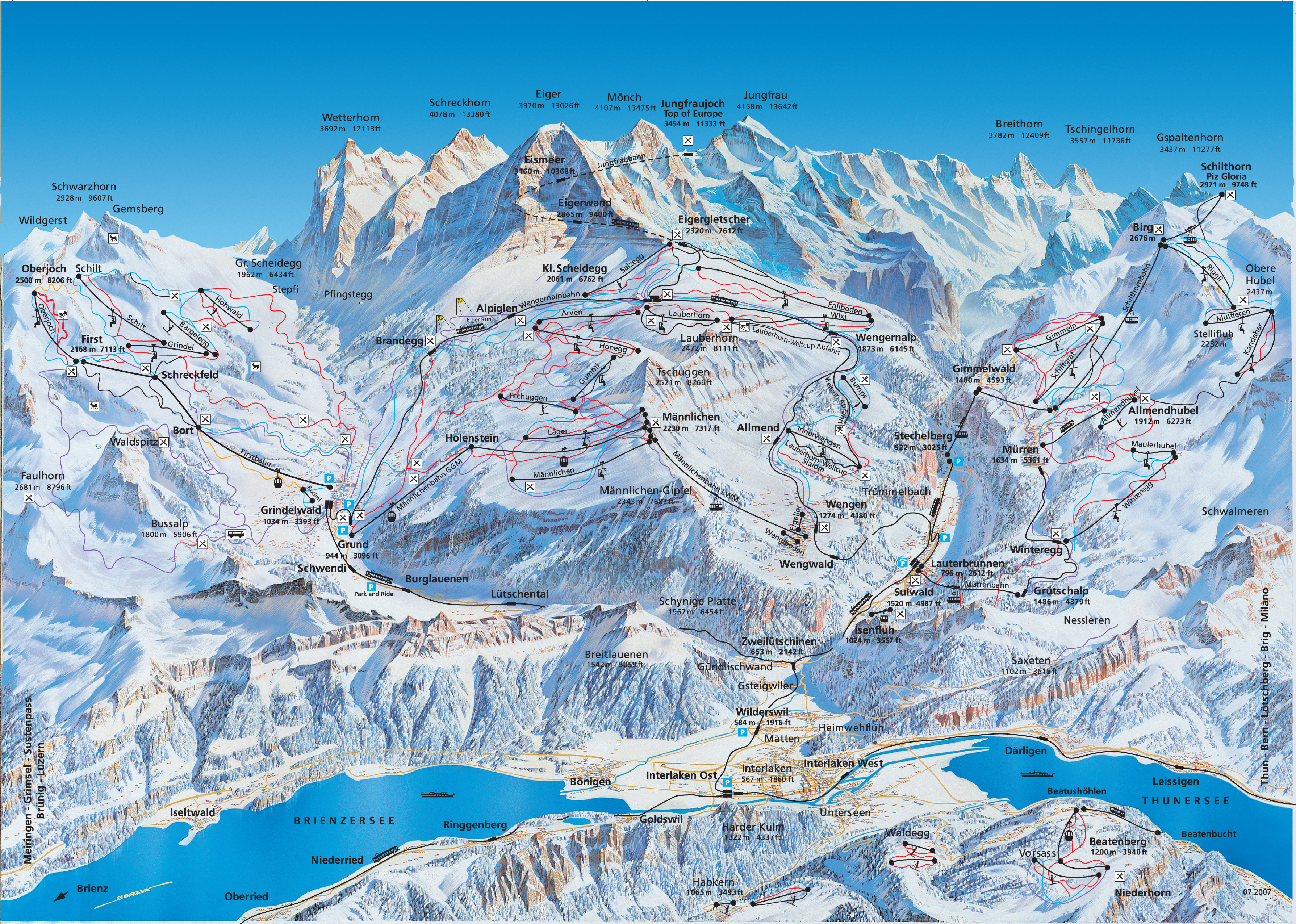
8. Let’s hit the slopes

When you think of Switzerland, you think of skiing, and the Swiss Alps have some of the top ski resorts in the world. One thing I love about the alpine ski resorts, aside from the great slopes, are the beautiful hand drawn piste maps. Here’s one of the Grindlewald/Wengen area in the Bernese Oberland. Just looking at it makes me want to start planning next year’s ski trip.

9. Direct democracy

Anti-Einwanderungsinitiative 2014.svg

“Anti-Einwanderungsinitiative 2014” by Furfur, based on the file Kantone der Schweiz.svg, made by KarzA. – Own work, data source: Neue Zürcher Zeitung: SVP-Abstimmungskrimi vorbei: Die Überraschung ist perfekt. Licensed under CC BY-SA 3.0 via Wikimedia Commons.

Switzerland is famous for its direct democracy, the process whereby voters frequently weigh in on referendums, popular initiatives, and even have veto power over laws.  The Swiss vote a lot. Elections happen about four times a year and often contain several referendums at the national, cantonal, and local level, as well as ballots for elected representatives.

The map above shows the results of a popular initiative in 2014 that sought to restrict immigration by EU nationals into Switzerland. It passed narrowly, with strong support from the Italian- and German-speaking regions and despite opposition in the French-speaking regions.

Immigration is a contentious issue in Switzerland (as in many other parts of the world). Relative to its population, immigration levels are quite high, compared to say, Germany or even the U.S. In some cases, xenophobia wins out in popular initiatives, such as when the Swiss voted in 2009 to prohibit the construction of minarets.

10. A rich cartographic history

Dufour
With its varied geography and strong scientific and educational traditions, it’s no surprise that Switzerland has produced some stunning cartography. The first official map series to encompass all of Switzerland was produced by Guillaume-Henri Dufour and published from 1845-1865. The result of decades of surveying, drawing, copperplate engraving, and printing, the map achieved a high level of accuracy and detail for its time, and is also distinguished by the attractive use shading to show topography. More information on the Dufour map, as well as the equally impressive Siegfried map is available here.

Swiss excellence in mapping continues to this day. For example, the Federal Geoportal has a great mapping tool that allows you to access and display hundreds of data layers, from road networks to wetlands.

5

Weighted Density and City Size: Who Knew Milwaukee Is So Dense

You’re probably familiar with the concept of population density. It’s the total population divided by the area. When talking about cities, it’s commonly understood that high population density is a necessary if not sufficient condition for urban vibrancy and efficient mass transit. But it can be difficult to compare population densities of metropolitan areas because the administrative boundaries have an arbitrary effect on measurement. For example, if the LA metro area is defined at the county level and includes all of San Bernardino County, which is mostly empty desert, you get a pretty meaningless density measurement.

Now, you can look at smaller administrative areas to get a better handle on the population density of a city. In the U.S. the census tract is the highest resolution. With the areas and populations of each census tract, you can calculate an even more interesting metric: population-weighted density, which is the the average of each resident’s census tract density. That means that areas where more people live get more weight in the overall density calculation.

Another way to think about population-weighted density is the density at which the average person lives. The simple population density of the entire U.S. is 87 people per square mile. That really does not tell us much. But the population-weighted density is over 5,000 people per square mile. The average American lives in an urban area. (That example is from a U.S. Census report on metropolitan areas.)

An interesting (if not intuitive) insight from population-weighted density is the strong relationship between city size and density. Big cities are more dense. The plot below shows the population weighted densities and total populations of the 100 U.S. largest cities (well, technically core-based statistical areas). Click on the image for the interaction version if you want to mouse over the dots to identify individual cities.

Larger US Cities have Higher Population-Weighted Densities

Click for interactive version. Note log-log scale.

The cities are categorized by region, showing the general pattern that southern cities are the least dense and northeastern and western cities the most dense. This regional difference is emphasized in the linear fits shown for each region. I was surprised by how dense on average the western cities are. Honolulu is a real outlier in terms of having a high density for its size. Unsurprisingly, the sprawling giants of Atlanta, Dallas, and Houston are low-density outliers.

Incidentally, I got the idea for this graph after listening to a very interesting podcast on Streetsblog about the urban form of Milwaukee. It mentioned that Milwaukee is actually one most the most dense cities for its size, especially when looking in the Midwest. And sure enough, Milwaukee lies well above the blue trend line for Midwest cities. If you have 45 minutes and are interested in Milwaukee you should definitely listen to the podcast. Full disclosure: I was born and raised there.

Technical notes: Plot made with plot.ly using data from U.S. Census. The color palette is inspired by the film Rushmore and is from Karthik Ram’s wesanderson R package. Yes, this was all an elaborate excuse to try out the Wes Anderson color palettes.

A nice in-depth look at urban density and implications for transit can be found here.

Finally, if you are interested in extreme urban density, check this out. I can’t vouch for the accuracy of the data, but the web site name suggests it’s probably pretty legit.

0

Two Ways to Map Global Mercury Emissions

I’ve been playing with an interesting dataset recently, and it got me thinking about challenges in effectively visualizing geospatial data. Specifically, how do you best display a continuous variable whose values span several orders of magnitude?

The dataset I’m working with comes from the Arctic Monitoring and Assessment Program. It’s a estimate of global anthropogenic emissions of mercury per 0.5 x 0.5 degree grid square. One important reason why AMAP generated these data (and how they did it is an interesting problem and the topic for another post) was to help atmospheric transport modelers who need to know where on earth emissions are coming from. But the data also allow for a nice visualization of global sources of mercury pollution that goes beyond simple maps showing emissions by country.

I’ll present two options here, and I’d love feedback on what works best. I think there are also trade-off depending on what the purpose of the visualization is (presentation vs. exploration) and the scale. Both are made on CartoDB. You can zoom, scroll, and click on a point to see the data. Check out the full-screen option which I think is pretty cool.

The first is perhaps the more flashy one. It uses yellow circles whose size are proportional to mercury emissions. There is a multiply effect so areas of overlap appear orange-red.

This one is a more traditional chloropleth approach using an orange-red scale to represent the magnitude of emissions over each grid square.

Some technical notes:

The dataset contains around 45,000 grid squares (areas with no anthropogenic emissions, like oceans, are no data) with mercury emissions ranging from about 10^-5 to 12,000 kg. That’s around 8 orders of magnitude. Some quick exploration of the data revealed that almost all the mercury emissions came from less than 10 percent of the model area.

global hg dist

Cumulative sum of mercury emissions (normalized to 1) as a function of magnitude of emissions in each cell. Almost all emissions are from cells with greater than 10 kg emissions. Note log scale on x axis.

Most areas have very small emissions, but a few have very high emissions. The data are like this because the emissions estimates are made using both point sources, “area” sources like artisanal mining, and population as a proxy for some general emissions. In any case, to facilitate visualization I  removed the very-low-emissions-value grid squares. The remaining ~5000 squares comprise ~93% of total emissions. These data still have a pareto-like distribution ranging almost three orders of magnitude, but they are easier much easier to display on a map.

global hg dist tail

Cumulative sum of mercury emissions (normalized to 1) as a function of magnitude of emissions in each cell. Cells with < 50 kg Hg removed. Note log scale on x axis.

Note that the maps display mercury emissions per square km for each cell, not total mercury emissions. That is because the areas of the 0.5 x 0.5 grid cells vary with longitude. Those closest to the equator are larger, closer to the poles are smaller. So it makes for a more accurate display to normalize by the cell area.

An important factor in the visual appearance of continuous data like these is where to choose the breaks separating data points into different colors or sizes. This is especially difficult with pareto or power law distributions. CartoDB has several built in options for binning data. After playing around with them I choose head/tail breaks, which seems to work well on this type of distribution. CartoDB also allows you to easily change the breaks manually with cartoCSS. It was a challenge to find a binning and color/size scheme that portrayed the data in the most accurate way, while also maintaining a clear and striking appearance.

Color on the chloropleth comes from colorbrewer.

For more information on the development on the emissions model, see this paper.